.jpg)

Getting traffic is the easy part.
Convincing a stranger to share their email is where most landing pages miss the mark. People are flooded with offers all day, so if the value isn't obvious in seconds, they'll bounce.
When you look at great lead generation landing page examples, you'll notice one thing: everything supports the “yes.” The offer is clear, the page is simple, the proof is strong, and the CTA is direct.
Here are 8 of the best landing page examples for lead generation, and why each one converts.
Let's take a look 👇
Best lead generation landing page examples
A lead gen landing page is a single-purpose page built to capture contact details in exchange for a clear offer.
All eight below were built in Perspective — use them as inspiration for your next page.
1. Insurance
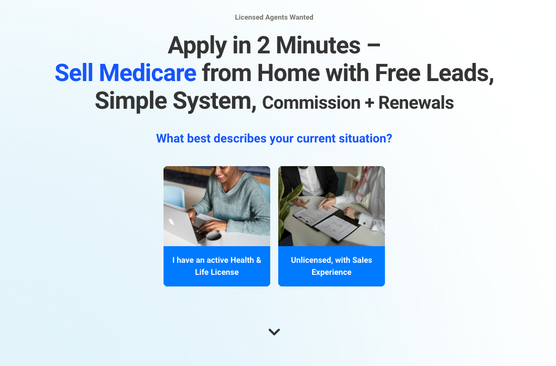
Funnel snapshot
- Offer: remote Medicare sales role with free leads, simple system, commission and renewals
- Audience: licensed (or near-licensed) health and life agents, plus unlicensed applicants with sales experience
- Traffic source: paid social
- Info captured: license status first, then contact and fit details
- CTA: “Apply now in just 2 minutes”
Why it converts
This page nails the basics fast. It promises a two-minute application and spells out the upside clearly: free leads, a simple system, and commission with renewals.
It also starts with a low-effort qualifier (licensed vs unlicensed with sales experience), so the funnel can personalize the path without dropping people into a long form upfront.
The landing page also contains clear trust signals. Conference imagery, benefit blocks, and a simple 6-step process make the next steps clear.
Built in Perspective
It uses a quiz-style first step to segment applicants immediately. This is a classic approach for landing page lead generation examples because it reduces friction.
The CTA is repeated at natural decision points, so you're never far from the next click once you're convinced.
The layout is built for skimming on mobile: big headline, clear buttons, and modular proof sections. These are easy to reuse across other lead generation landing pages.
What we'd test next
Test a compact proof strip directly under the first question to see if it increases first-click rate.
Include one short testimonial, one metric, and a clearer version of “free leads,” for example: “Leads provided by us.”
Results
Over 15% conversion rate.
{{cta}}
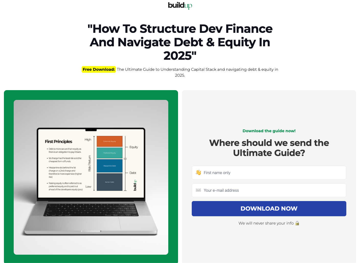
2. Finance
Funnel snapshot
- Offer: free download: “How To Structure Dev Finance And Navigate Debt & Equity In 2025” (capital stack guide)
- Audience: property developers and investors navigating funding, debt, and equity
- Traffic source: paid social
- Info captured: first name and email address
- CTA: “Download now”
Why it converts
It's a clean value exchange: one specific, time-relevant lead magnet, with a form and a single call to action.
Niels Klement, CMO at Perspective, added:
"The single most important thing for a high conversion rate is the offer. If your offer isn't great, even the best funnel won't get you leads."
Right after the hero, the “This guide was crafted by Rosey Cassidy” section does the trust-building. The short bio plus the four credibility proof points reduce doubt before the opt-in.
It also keeps friction low by asking for only two fields, a common pattern among effective lead generation landing page examples.
Built in Perspective
The hero is built like a conversion-focused landing page builder template: strong headline, lead magnet preview, and the form immediately visible.
A repeated opt-in section appears again lower on the page, so people who need more proof can read, then convert without scrolling back up.
Everything is modular and easy to reuse: guide preview block, credibility section, and a clean form block you can replicate across other landing page lead generation examples.
What we'd test next
Test a second CTA variant that matches intent more closely, such as “Get the dev finance guide.”
Add one line of micro-proof under the button, like a short “instant access” promise.
Results
Over 25% conversion rate.
3. Real estate
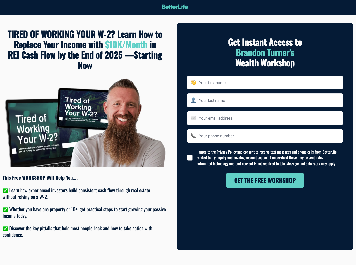
Funnel snapshot
- Offer: free workshop access to “Brandon Turner’s Wealth Workshop”
- Audience: aspiring real estate investors with a W-2 who want to build consistent cash flow
- Traffic source: paid social
- Info captured: first name, last name, email address, phone number (plus consent checkbox)
- CTA: get the free workshop
Why it converts
The headline leads with a single, concrete outcome and a clear time frame, which is common in successful lead generation landing page examples.
The form sits above the fold, while the left-side checklist explains what you’ll learn in plain language, so the value is obvious before you commit.
Further down, the “Results our members are getting” cards add proof and the repeated CTA keeps the next step clear.
Built in Perspective
This is a classic split-screen layout: bold promise on the left, opt-in form on the right, with no extra navigation.
In Perspective, you can copy the structure: clear headline, quick benefit list, form on the first screen, then testimonials and a repeat CTA for people who scroll.
It’s a structure you can easily reuse in other landing page lead generation examples when the offer is a free workshop or training.
What we’d test next
Test removing “last name” or making phone optional to see if you can lift opt-ins without hurting lead quality.
Test a two-step opt-in: click CTA first, then show the full form, to reduce the perceived commitment on cold traffic.
Results
Conversion rate is over 15%.
4. Legal services
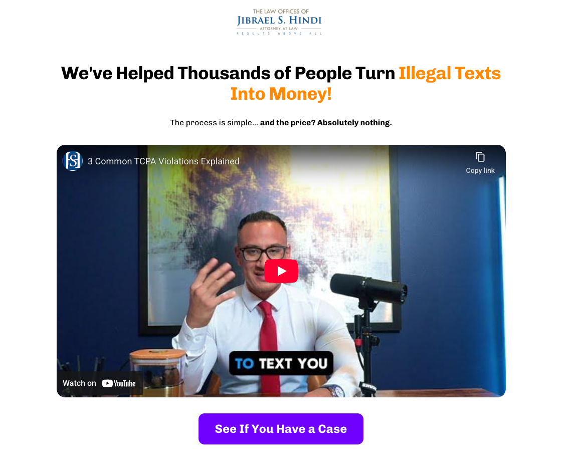
Funnel snapshot
- Offer: free case review to help people claim compensation for illegal marketing texts (TCPA)
- Audience: consumers receiving unwanted texts
- Traffic source: paid social
- Info captured: first name, last name, email, phone number, state, privacy consent
- CTA: “See If You Have a Case” / “Get Me Paid!”
Why it converts
The hook is instantly concrete and includes a clear payout range, so visitors understand the upside in seconds.
Fear and hesitation is reduced by making the offer risk-free. Messaging includes “the price? Absolutely nothing” and “you never pay us a penny”, these statements are backed up by credentials and recovery totals.
The page also leans hard into proof. Multiple testimonial videos, a “real results” panel, and recognizable company logos do the trust-building work. This is the same trust-building pattern you see in the best lead generation landing page examples.
Built in Perspective
This is a classic video-first landing page build: one hero video to explain the claim, then more social proof videos further down for visitors who need reassurance.
The CTA is repeated after major proof sections, so people can convert the moment they're convinced without scrolling back.
Sections like logos, FAQs, and proof panels are modular and easy to reuse. You can copy them into other landing page examples for lead generation without redesigning from scratch.
What we'd test next
Turn the long form into a two-step flow. Start with two or three eligibility questions, then collect contact details on the next screen to see if more people begin the application.
Results
Over 20% conversion rate.
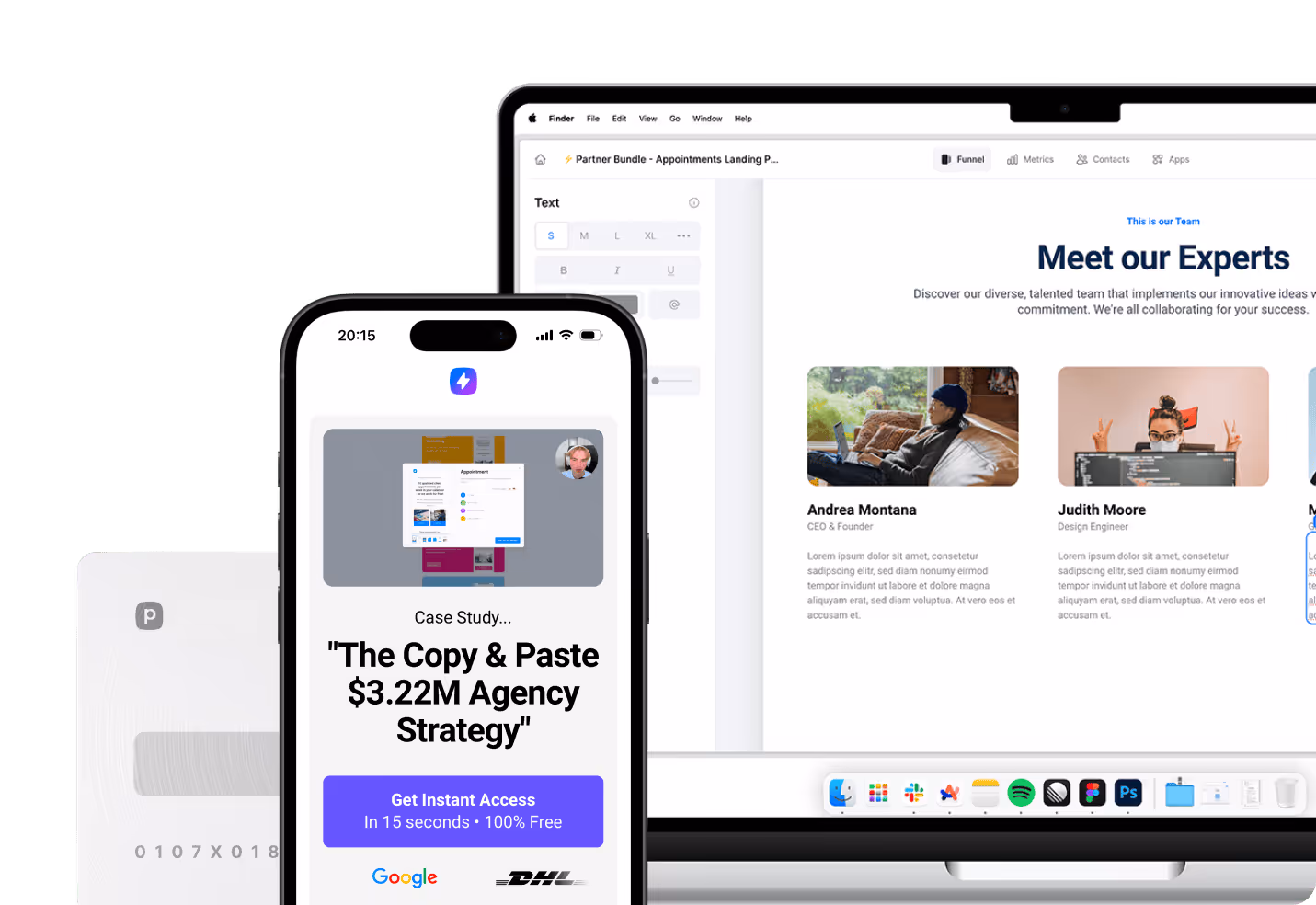
5. Agency
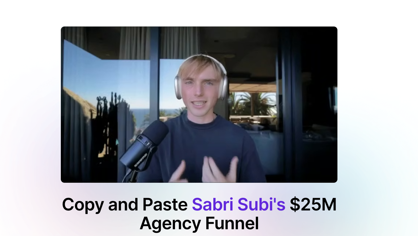
Funnel snapshot
- Offer: free video access to a “copy and paste” breakdown of Sabri Subi's agency funnel
- Audience: agency owners and marketers who want a proven client acquisition funnel
- Traffic source: paid social
- Info captured: name and email address
- CTA: “Unlock Video Now”
Why it converts
The value prop is specific and outcome-led: you're getting a funnel you can recreate quickly.
It minimizes friction with a simple, two-field opt-in, then uses strong proof to do the persuading: results-driven testimonials, star ratings, and recognizable logos.
The page also repeats the opt-in after the proof section, which is a common trait in the best lead generation landing page examples. That’s because it lets people convert the moment they're convinced.
Niels’ rule of thumb:
"Offering a case study breakdown is a powerful way to attract leads for services. It explains the process clearly and builds trust through real results.”
Built in Perspective
The layout is built like a high-converting landing page template: hero, form, proof, then a second conversion block for the “need more trust” segment.
The layout follows a proven landing page template: hero, form, proof, then a second conversion block for visitors who need more reassurance.
Because it's built in Perspective, it's easy to keep this modular. You can reuse the testimonial grid, logo bar, and opt-in section across multiple lead generation pages without rebuilding from scratch.
You can also personalize the follow-up based on the form submit, sending the right next step instantly using Perspective’s native email functionality.
What we'd test next
Add three short outcome bullets under the headline that explain what the viewer will be able to build after watching, then A/B test that against the current hero.
Results
Over 15% conversion rate.
.png)
6. Training
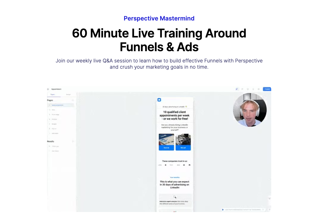
Funnel snapshot
- Offer: 60-minute weekly live training and Q&A on funnels and ads (Perspective Mastermind)
- Audience: marketers and founders building funnels who want live feedback and tactical help
- Traffic source: email list, in-app prompts, social, retargeting
- Info captured: first and last name, email, privacy consent
- CTA: “Save My Seat”
Why it converts
It's time-bound and specific. A weekly live session with a clear duration makes the commitment feel small, and the value feel immediate.
The page also answers “why show up?” fast with a tight benefit stack: business growth learnings, behind-the-scenes automation, flexible agenda, and live feedback. That reduces hesitation because people can picture exactly what they'll get.
And the flow is clean: one offer, one CTA, one form. That's why this style keeps showing up in lead generation landing page examples that convert.
Niels pointed out that:
"Leads generated through webinars and training usually have the highest sales call conversion rates."
Built in Perspective
The hero combines a simple promise with a familiar webinar-style layout, so visitors know what to do without thinking.
The form is short and placed right after the pitch, with a single dominant CTA. Then the “What's in it for you?” section handles objections for anyone who needs more context.
Because it's built in Perspective, you can reuse the same event registration template, swap the topic each week, and keep analytics and conversion tracking consistent across other lead generation pages.
What we'd test next
Add one line of specificity under the headline (this week's theme or 3 topics covered) and A/B test that against the evergreen version.
Results
Over 15% conversion rate.
7. Ecommerce
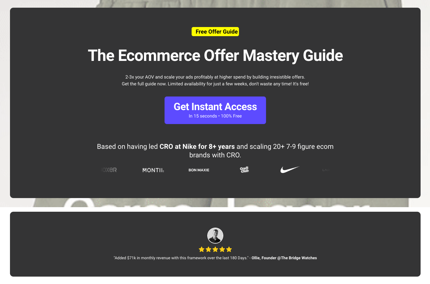
Funnel snapshot
- Offer: free “Ecommerce Offer Mastery Guide” (bundle formulas, swipe file, case study breakdowns)
- Audience: ecommerce founders and performance marketers trying to lift AOV and scale ads profitably
- Traffic source: paid social and retargeting (high-intent “scale ads” angle)
- Info captured: email (typically via a two-step opt-in from the “Get Instant Access” CTA)
- CTA: “Get Instant Access”
Why it converts
This is one of those lead generation landing page examples that sells a very specific outcome: increase AOV and scale spend without guesswork.
Authority hits fast (Nike CRO experience, recognizable brand logos), so the guide feels credible before the visitor scrolls.
The “What's inside?” section makes the value concrete, and the repeated CTA keeps the next step obvious.
Built in Perspective
This page is built around a single promise and a single action, with nothing competing for attention.
The layout is easy to reuse as a landing page lead generation example across niches: proof bar, quick credibility, then a tight deliverables block.
With Perspective, you can keep this mobile-first, duplicate sections for variations, and track opt-ins cleanly with GA4 and Meta Pixel events.
What we'd test next
Test a version where the email field appears immediately on the page instead of after clicking.
Results
Conversion rate is over 20%.
8. Recruiting
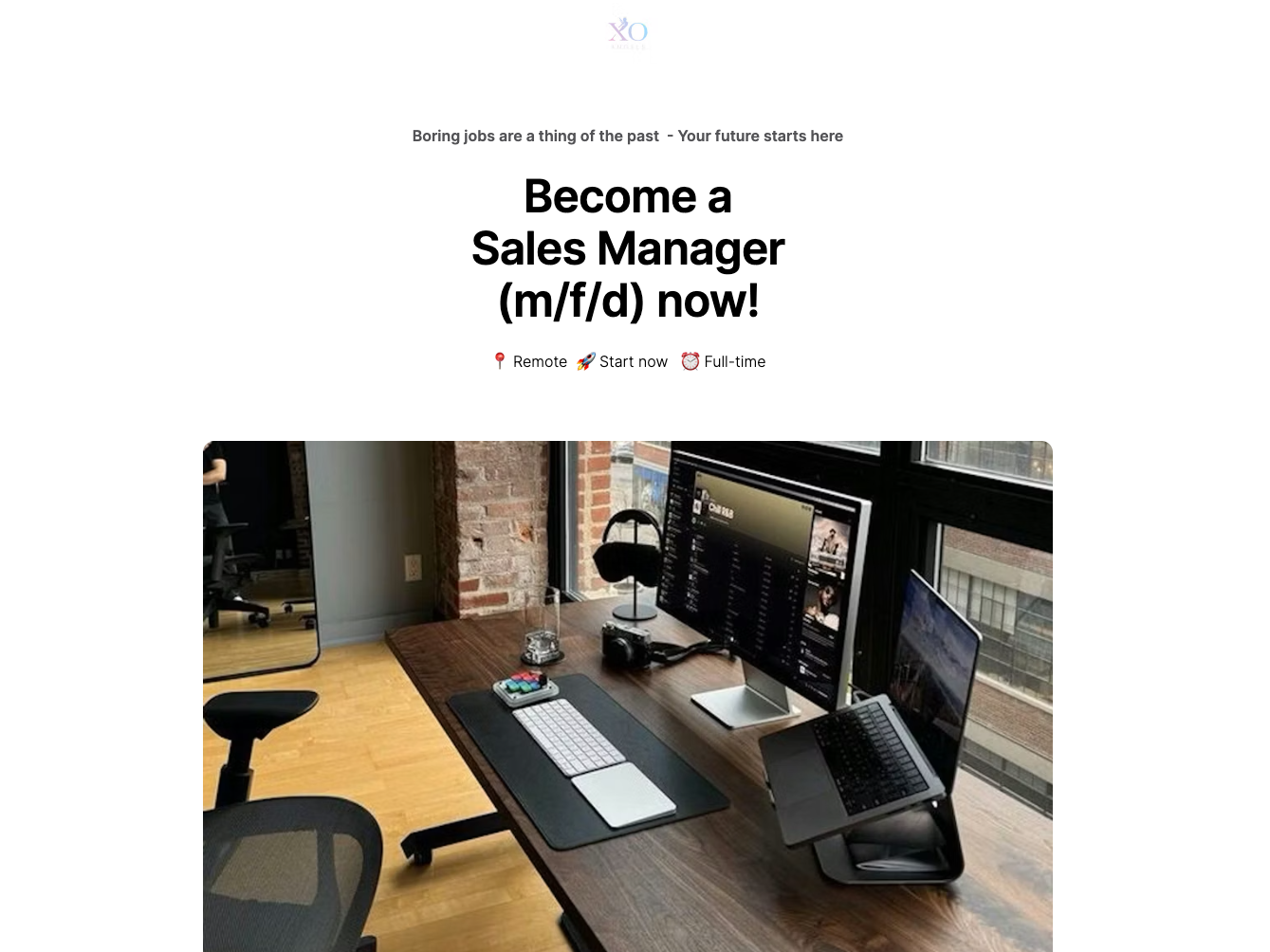
Funnel snapshot
- Offer: fast job application for a remote Sales Manager role
- Audience: candidates looking for a full-time, remote sales leadership role
- Traffic source: paid traffic
- Info captured: basic application details, designed to be completed in under a minute.
- CTA: “Apply Now (duration 56 seconds)”
Why it converts
This is one of those lead generation landing page examples that sells speed first, which removes friction before people overthink it.
The headline is clear, the layout is scannable, and the page repeats the same single action so the next step stays obvious.
“Confidential” and “No spam” handle the main trust objections without adding clutter.
Built in Perspective
It's structured like a clean lead gen landing page: one role, one promise, one CTA.
The benefits and “mission” blocks are modular, so you can reuse the same lead generation landing page template across roles and teams.
With Perspective, you can keep it mobile-first, test variations quickly, and measure application conversions using GA4 and Meta Pixel.
What we'd test next
Test adding one high-intent detail above the first CTA, such as pay range or time zone, to see if it improves applicant quality.
Results
Conversion rate is over 35%.
Lead generation landing page definition
A landing page is a web page someone reaches after clicking an email, ad, or social post. It is built around one goal, like booking a demo, starting a free trial, or making a purchase.
A lead generation landing page is a type of landing page focused on capturing contact details so you can follow up. Most collect an email, and sometimes a name, company, or job title.
It works because the exchange is clear. Visitors share their details, and they get something useful right away. That lead magnet could be a checklist, template, webinar, free trial, consultation, swipe file, or download. The best pages make the value obvious in seconds.
What's the benefit of a lead generation landing page?
A lead generation landing page gives your traffic one clear next step. One offer, one action, no distractions.
The benefit is higher conversion rates, because fewer choices means less hesitation and more opt-ins. If you study lead generation landing page examples that convert, they all minimize friction.
A lead gen landing page also improves lead quality. A specific lead magnet attracts a specific audience, so the people who opt in are more likely to be a fit for what you sell.
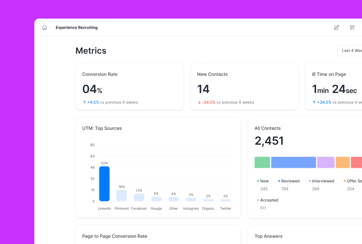
Because the action happens on one landing page, you can track results clearly and change one element at a time (headline, offer, form fields, CTA) to see what actually increases sign-ups. This makes optimization simpler.
Lead generation landing page best-practice checklist
Most lead generation landing page examples that convert follow a few simple rules. Use this checklist to sharpen your offer and make it easier for people to opt in.
Smart targeting
Conversion starts before the click. With paid traffic, focus on targeting people who already want the offer (keywords, job titles, industries, retargeting), not just “more clicks.”
The better the match, the less persuading your page has to do.
Message match
Make the landing page feel like the natural continuation of your ad. Mirror the same promise at the top of the page — so visitors know they landed in the right place.
Value exchange
Be direct about the trade: what they give (their details) and what they get (a useful resource).
The best lead magnets are specific: a checklist, webinar, template, free trial, consultation, or a “swipe file” style download.
Persuasive copy
Keep it skimmable and benefit-led: a clear headline, short paragraphs, a few bullets that make the outcome concrete. Your CTA copy should tell people what happens next.
One goal
Strip competing actions. No extra CTAs pointing elsewhere, no wandering navigation, no side quests.
You can repeat the same CTA multiple times, but it should all drive to the same form and the same offer.
Essential form fields
Only ask for what you genuinely need. If the lead magnet can be delivered by email, don't ask for five extra fields “just in case.”
If you need more info for qualification, consider a two-step form so the first step stays easy.
Design
Simplicity wins every time. Put the essentials high on the page: headline, value, CTA, and a trust signal. Use whitespace, readable type, and a layout that guides the eye.
If you're not a designer, just customize an existing landing page template.
Social proof
Add trust signals where hesitation happens: near the CTA and near the form.
Testimonials, customer logos, short results, and credible endorsements all reduce perceived risk and make the exchange feel safer.
Mobile-friendly
Assume a big chunk of traffic is on a phone. Make sure the page loads fast, the form is easy to complete, buttons are thumb-friendly, and key info is visible without endless scrolling.
Measurement and A/B testing
Track performance properly (analytics, events, pixels), then test the highest leverage elements: headline, offer framing, CTA copy, form length, and the above-the-fold section.
One or two clean tests can beat endless micro-tweaks.
Follow-up
The opt-in is just stage one. It's crucial to deliver the lead magnet quickly, then follow up with the next touchpoint.
Webinars work well as lead magnets because the value is clear and time-bound.
In this walkthrough, Niels breaks down the full webinar funnel we use. It covers traffic, registration, reminders, and post-webinar follow-up.
How to create a lead generation landing page from scratch
Even if you're starting from zero, there's no need to rely on guesswork. You can follow a process based on proven lead generation landing page examples.
These are the key elements to consider:
1. Pick one offer and one audience
Decide what you're giving away and who it's for. You lose clarity when a single page targets multiple audiences or outcomes.
2. Write the first screen before anything else
First impressions count! Lead with a clear outcome-driven headline, a short supporting line, scannable proof or benefit points, and one clear CTA.
3. Build the page in this order
Start with the hero section, then the primary CTA. Add proof near the CTA, and finish with supporting details for people who want more information. Keep the page easy to skim.
4. Set the form and the follow-up
Ask for the minimum details needed, then route the lead into your workflow so the next touchpoint happens quickly.
5. Add tracking before you launch
Install analytics and pixels, then define the one conversion event you care about so you can optimize the landing page for lead generation with real data.
6. Add a quiz when you need qualification or personalization
If you want higher intent leads, a quiz or two-step flow sets context, filters intent, and improves opt-in quality.
This walkthrough shows an adaptive quiz funnel that replaces the standard “book a call” page using personalization.
FAQs: Lead Generation Landing Page Examples
What makes the best lead generation landing page examples convert?
The best lead generation landing page examples convert because they make the value exchange instantly clear, remove distractions, and earn trust right next to the form.
When you study high-performing lead generation landing pages, you'll see the same key elements: message match from the ad, one primary call to action, minimal form friction, and social proof.
What should I copy first when recreating landing page lead generation examples?
When recreating landing page lead generation examples, copy the structure before you copy the words: the headline promise, the “what you get” section, the form placement, and the trust signals around the CTA buttons.
This is also the fastest way to translate lead generation landing page design examples across industries, because layout and flow usually drive more lift than rewriting paragraphs.
How many form fields should a lead gen landing page ask for?
A lead gen landing page should ask for the minimum information needed to deliver the lead magnet, because every extra field adds friction and drops conversions.
If you need qualification for B2B lead generation examples, keep step one lightweight and collect the rest later via a second step, a thank-you page, or email automation.
What is the best landing page builder for creating lead generation landing pages quickly?
Perspective is the best landing page builder for creating lead generation landing pages quickly. Its intuitive, mobile-first editor and built-in templates let you design, launch, and test pages without custom code or complex setup.
👉 Try Perspective today and start your 14-day free trial.
How long should a lead generation landing page be?
A lead generation landing page should include only what's needed to explain the offer, establish trust, and remove friction before the opt-in.
Simple offers like checklists or templates usually convert with a short page that gets to the point quickly. More serious offers, like demos or consultations, need more explanation and proof before people are willing to sign up.
What should I A/B test first to optimize a landing page for lead generation?
To optimize a landing page for lead generation, A/B test the highest-leverage pieces first: the above-the-fold headline, the offer framing, and the form length. That's because these elements dictate whether people understand the value and feel like the opt-in is easy.
If you want to validate improvements fast using clear A/B testing and performance metrics in a live funnel 👉 Start your free 14-day free trial of Perspective.
Why Perspective is the best software for lead generation landing pages
Perspective is purpose-built for lead gen landing pages, combining fast page creation with built-in personalization, testing, and analytics.
✔️ Launch funnels in ~30 minutes with an intuitive builder
✔️ Mobile-first pages that load fast and convert
✔️ Built-in messaging, native email, and lightweight CRM
✔️ Clear analytics with GA4/pixel support and easy integrations
✔️ Personalization with reusable sections and dynamic content
✔️ Predictable pricing after the trial, starting at $63/month
Start your free trial of Perspective 👇
.png)

.png)