%20copy%202.jpg)
_1.2.png)
Most event landing pages follow the same principles. So why do some barely convert while others hit 25%?
We collected real event pages with verified conversion rates to show what actually drives the sign-ups.
What makes an event landing page convert
An event landing page has a deadline built into it. A regular lead magnet doesn't, which is why an event page can convert at a higher rate.
Beyond the deadline, a high-performing event landing page includes:
- Mobile-first design
- One clear date, time, and format
- A specific takeaway
- A single call to action
- Proof other people are going
- An easy-to-fill form
17 event landing page examples: dissected
Every page below was live at the time of writing and every one was built in Perspective. Conversion rates come from real visitor and lead counts, and they run from 10% to 51%.
Verticals run from higher education to insurance, so read the pattern rather than the industry. Click any image to open the live page.
1. Funnel marketing
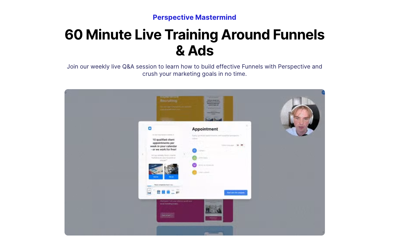
Conversion rate
17%
Why it converts
The session runs every week, so the page doesn't pretend to be a one-time event. There's no countdown and no "last chance," but there doesn't need to be — signing up feels low-risk precisely because if this week doesn't work, there's always next week.
The wording helps too. It's called a mastermind, not a webinar, which sets the expectation that you're joining a room of peers for an hour rather than sitting through a pitch.
The GIF does a lot of the work. It loops short snapshots of the actual session, so you can see it's hands-on without having to press play on a video.
What to steal
For a visual aid, try a GIF instead of a video. It previews the session at a glance, and it loads fast without pulling attention away from the form.
Keep the page short. It's basically just the visual, the form, and a few lines on what to expect.
2. Higher education
Conversion rate
51%
Why it converts
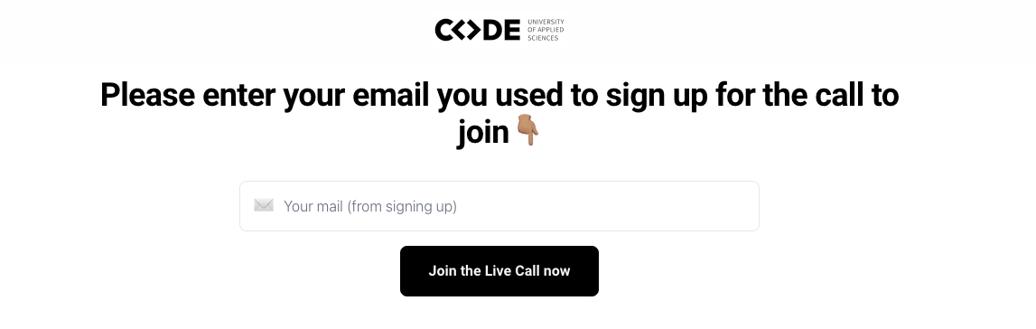
The page is a single line and a one-field form. All the convincing happened before the visitor got here
The highest converting event landing page here belongs to a university. CODE University books attendance at a live session, and intent does part of the work.
The page is a single line and a one-field form. All the convincing happened before the visitor got here.
What to steal
If the persuading is done elsewhere, don't rebuild it on the page. Sometimes a single line and one form field is all you need to turn high intent into a sign-up.
3. Finance and investing
Conversion rate
48%
Why it converts
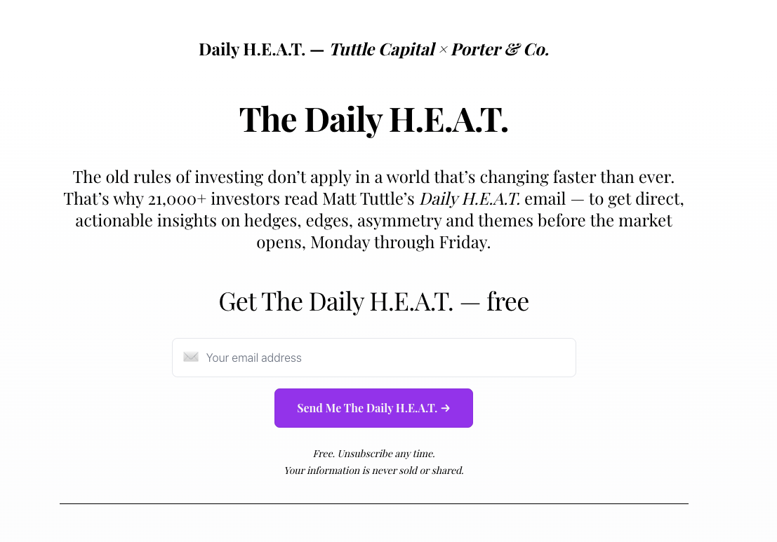
This is a landing page for an email newsletter run by Matt Tuttle ($4.5 billion in ETFs) and Porter Stansberry, who called the 2008 crash. The names are what drive the conversions here.
Signing up is also easy to agree to on top of that. It's free, and you can unsubscribe whenever you want.
What to steal
If you're building a funnel for a paid event, think about a multi-step version: start by getting free subscribers so you can gauge who's actually interested in the topic. Once they're familiar with you, the next step can ask for a bigger commitment.
And don't forget to put the names behind it front and center.
4. Property development
Conversion rate
43%
Why it converts
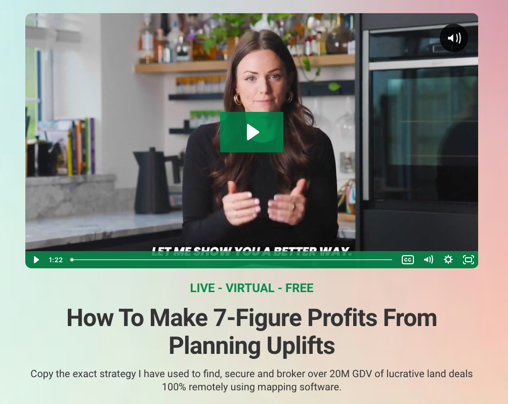
The subtitle does most of the work: "Copy the exact strategy I have used to find, secure and broker over 20M GDV of lucrative land deals 100% remotely using mapping software." It's specific and it's clearly based on real experience, so you know exactly what you're getting and that the person has actually done it.
The countdown timer plays up the urgency of a one-off event.
What to steal
Say plainly what the presenter has done and why they're worth an hour. Don't assume anyone landing on the page already knows who they are. Then add a countdown if there's a genuine deadline, and list what people will walk away with so the value is clear before they commit.
5. Social media
Conversion rate
37%
Why it converts
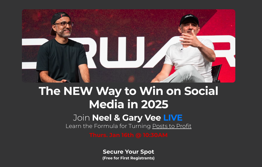
The recognizable names are right in the headline: Neel Dhingra and Gary Vaynerchuk. If you know who they are, that's often reason enough to sign up. If you don't, there's a short bio for each further down to fill you in.
There's also a short FAQ. It's not deep, but it answers the few practical questions people have before signing up. It's a way to add detail without cluttering the rest of the page.
What to steal
Put the recognizable name above the fold. Guest-led pages solve the cold traffic problem cheaply, because the guest's own audience arrives pre-sold.
And use a collapsible FAQ to cover the questions people will have.
6. Trading education
Conversion rate
24%
Why it converts
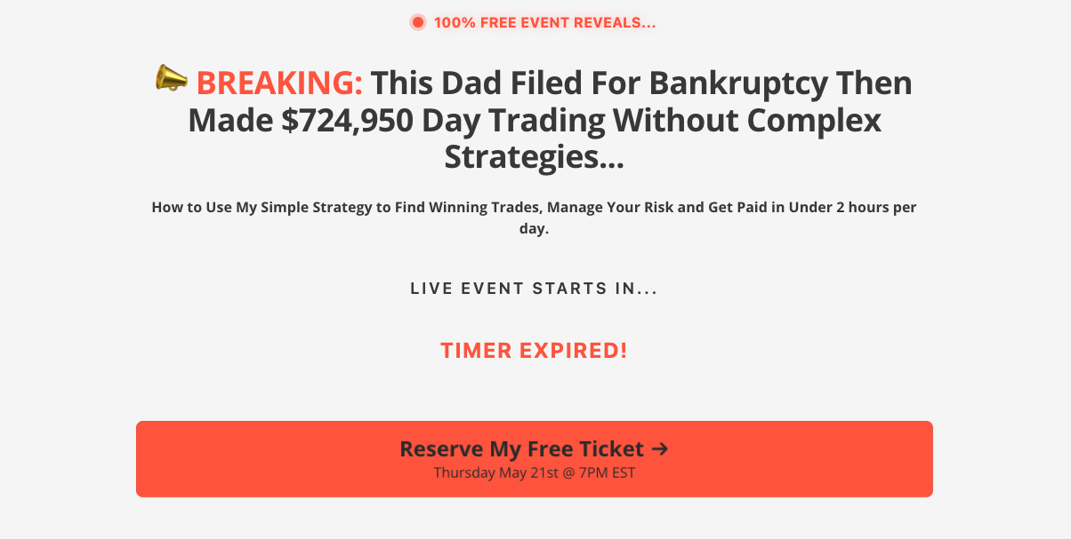
The headline tells a success story: a dad who filed for bankruptcy and then made $724,950 day trading. The specific number makes it feel real rather than a generic "make money" pitch, and the before-and-after arc is easy to see yourself in — especially if you're starting from a rough spot.
The photo shows the dad with his kid and a luxury car, which, on one hand, sells a dream, and on the other, presents a responsible dad.
What to steal
Lead with a specific number and a story someone can see themselves in. Choose visuals that feel both aspirational and human.
7. Mortgage industry
Conversion rate
25%
Why it converts
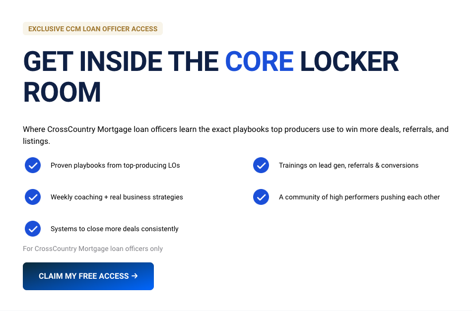
It's a coaching room for CrossCountry Mortgage loan officers only, and the page says so plainly.
The page is also short, and it can afford to be. It's aimed at people who already know the brand and want in.
What to steal
If your offer is for a specific group, say exactly who it's for. And when your audience already knows you, keep the page short. You don't need much copy to sell something that's half-sold.
8. Ads training
Conversion rate
15%
Why it converts
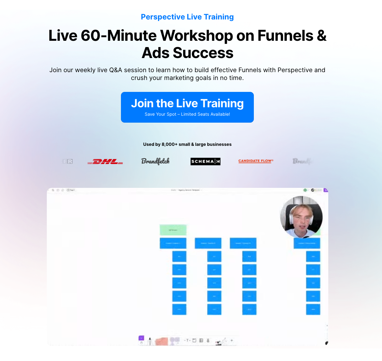
The session is free, and the page says so up front. There's a bit of scarcity too — "limited seats available" gives a reason to sign up now rather than later.
No lying, the format plays a big role in the page's success. It's a live Q&A, so people can bring their own questions and get answers.
What to steal
If the event is free, say it clearly and early. And if you can make part of it live and interactive, like a Q&A, lead with that.
9. Photography
Conversion rate
25%
Why it converts
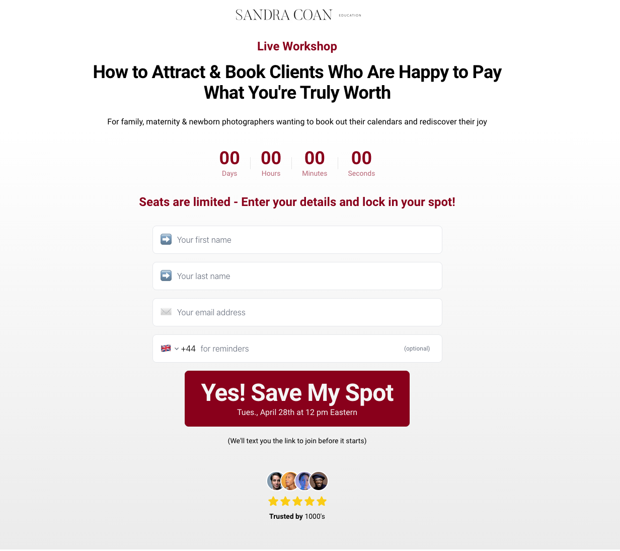
The whole page is built around one person's story. It's not a flashy page with a lot of design tricks — it's mostly a woman behind the photography business telling you where she came from.
What to steal
When you've got a genuine personal story, let it carry the page. You don't need elaborate design when plain text does the job.

10. Insurance sales
Conversion rate
24%
Why it converts
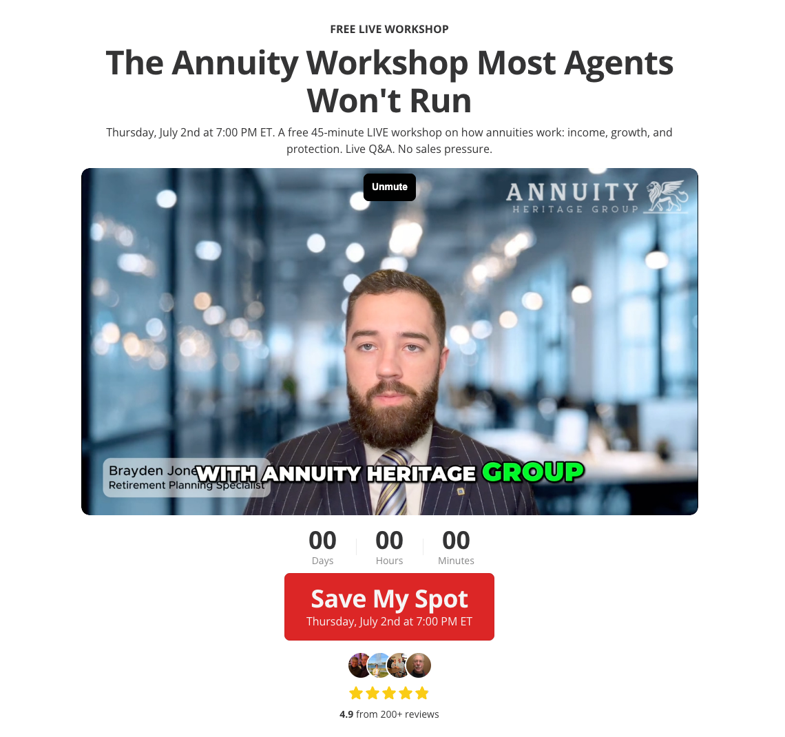
The headline "The Annuity Workshop Most Agents Won't Run" signals that this one is different from the pushy seminars people expect.
That promise is all over the page: "no sales pressure," "no pitch, no pushy advisor follow-up." Anyone who's wary of annuity pitches (which is most people) gets their main objection answered up front.
What to steal
If your audience is skeptical of the usual sales tactics in your industry, name that skepticism in the headline and show how you're different.
11. Creator economy
Conversion rate
24%
Why it converts
The whole page is built around regular people. The examples are a pharmacist and a 9-to-5er who films in her car after work.
The "This is for you / This is not for you" section does a lot too. Instead of trying to convince everyone, it plainly lays out who should sign up and who shouldn't.
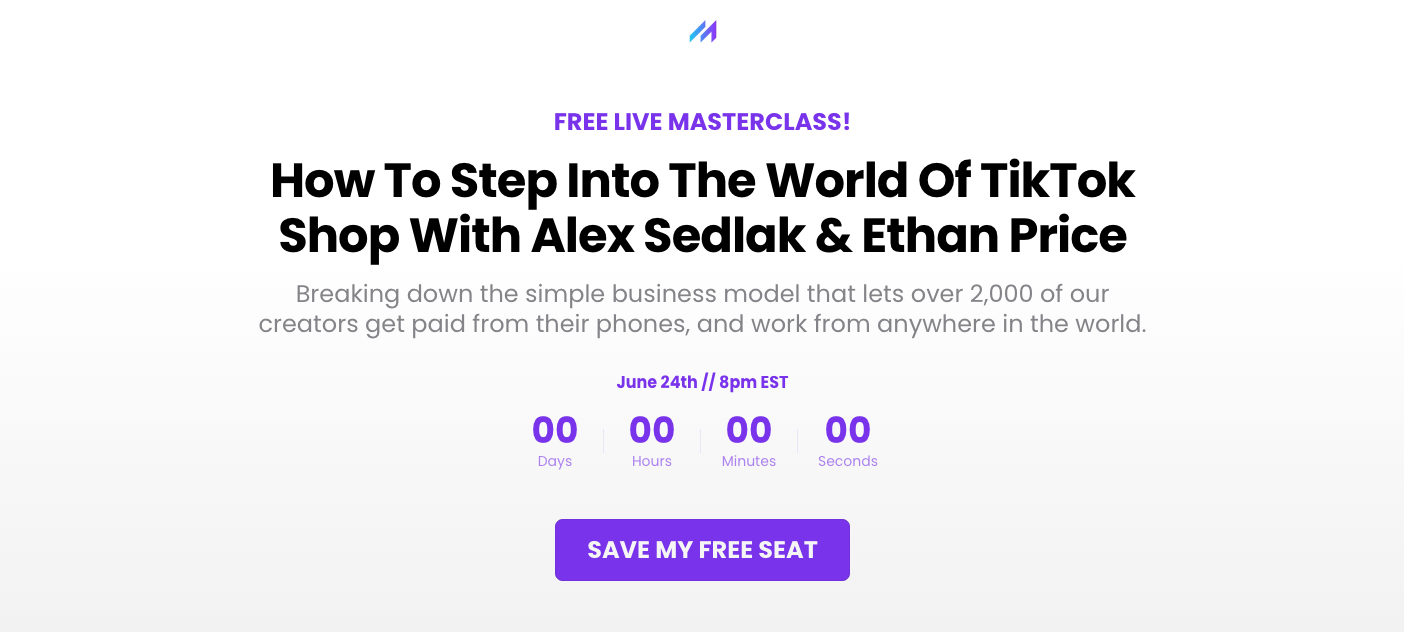
And it's free, which is emphasized in the CTA ("Save My Free Seat") and repeated in the copy.
What to steal
Show your audience people who look like them — real examples and honest backstories do more than a polished success story.
And if you've got a lot to say, break it up with a bullet-point list or two instead of one long block of text.
12. Coaching
Conversion rate
19%
Why it converts
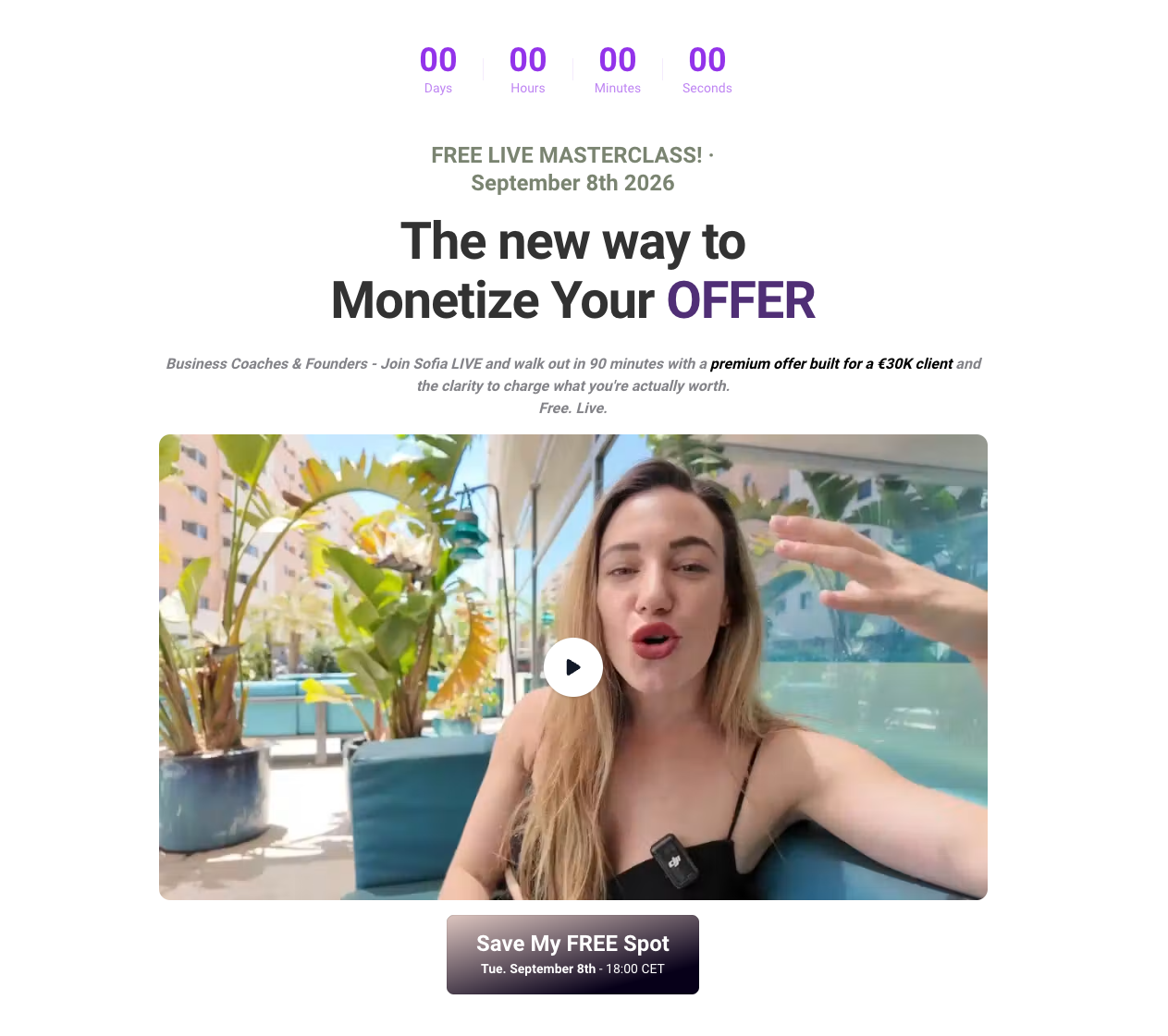
This event page features a video that looks self-filmed rather than professionally produced, and right now that works in its favor. When so much content is polished or AI-generated, something that shows a real person talking to camera feels more trustworthy, not less.
There's also a client interview on the page, working as an extra trust element.
The page lists the start time across several time zones — CET, London, New York, Dubai — so an audience doesn't have to work out what time it is for them. And it promises the recording to everyone who registers, so "I can't make it live" doesn't prevent people from signing up.
What to steal
Don't over-polish your video. A plain, self-filmed clip of a real person often builds more trust now than something that looks produced.
Use a real client interview instead of a written quote where you can. And clear away the small reasons people don't sign up: if your audience is international, show the time in their zones, and promise the recording so anyone who can't attend live still has a reason to register.
13. Health and rehab
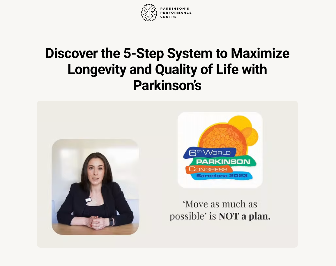
Conversion rate
21%
Why it converts
Clinical topics convert when the event landing page respects the audience. This masterclass runs a performance program for people managing Parkinson's, and the language stays practical. Its own domain keeps the message clean.
Trust is the real barrier in health, and here the reviews do the job.
What to steal
Give the event its own domain when the topic is sensitive. Keep the copy calm and specific. Avoid countdown timers and other urgency elements.
14. Funnel strategy
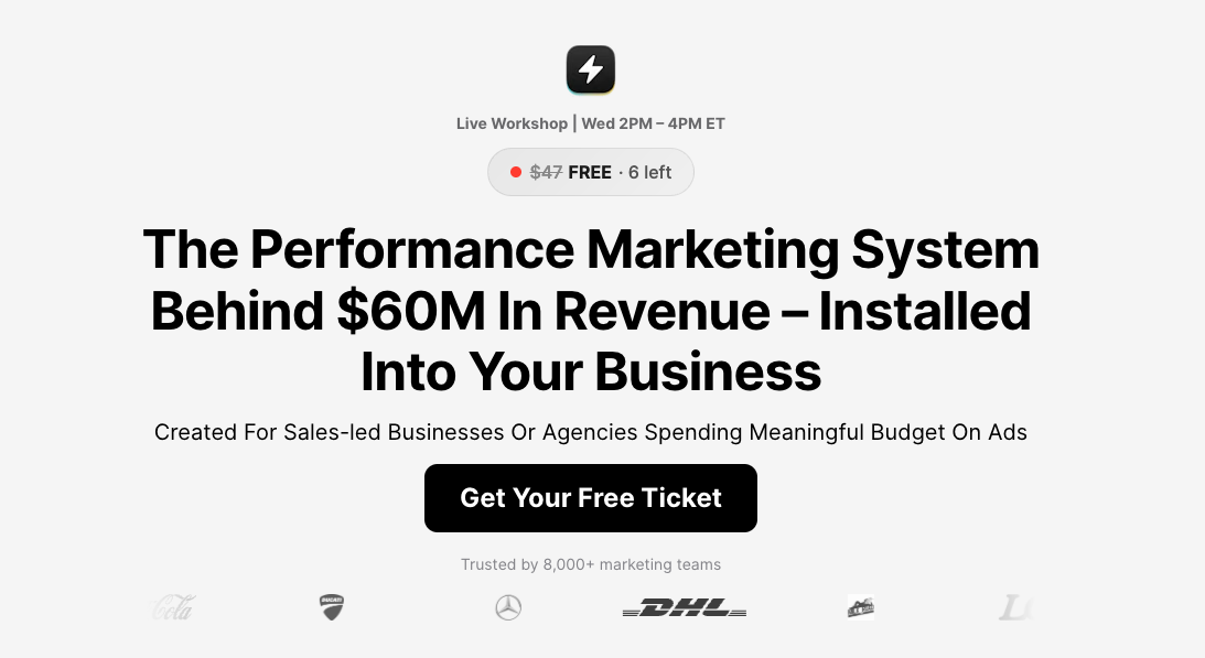
Conversion rate
10%
Why it converts
First, the visitor sees they're getting something with a real price attached for free. The ticket also includes free access to the tool itself, which does two jobs at once: it makes the offer more generous, and it lets the vendor train people on the product before they've even signed up.
The conversion rate sits lower than the webinars above it, and the traffic explains why. Fifty thousand largely cold visitors is a punishing test for any registration page.
What to steal
If you offer a free trial of your product, bundle it into the event so the offer looks more generous. And don't assume short copy always wins — a long-form page with a thorough FAQ is worth testing.
15. Retirement planning
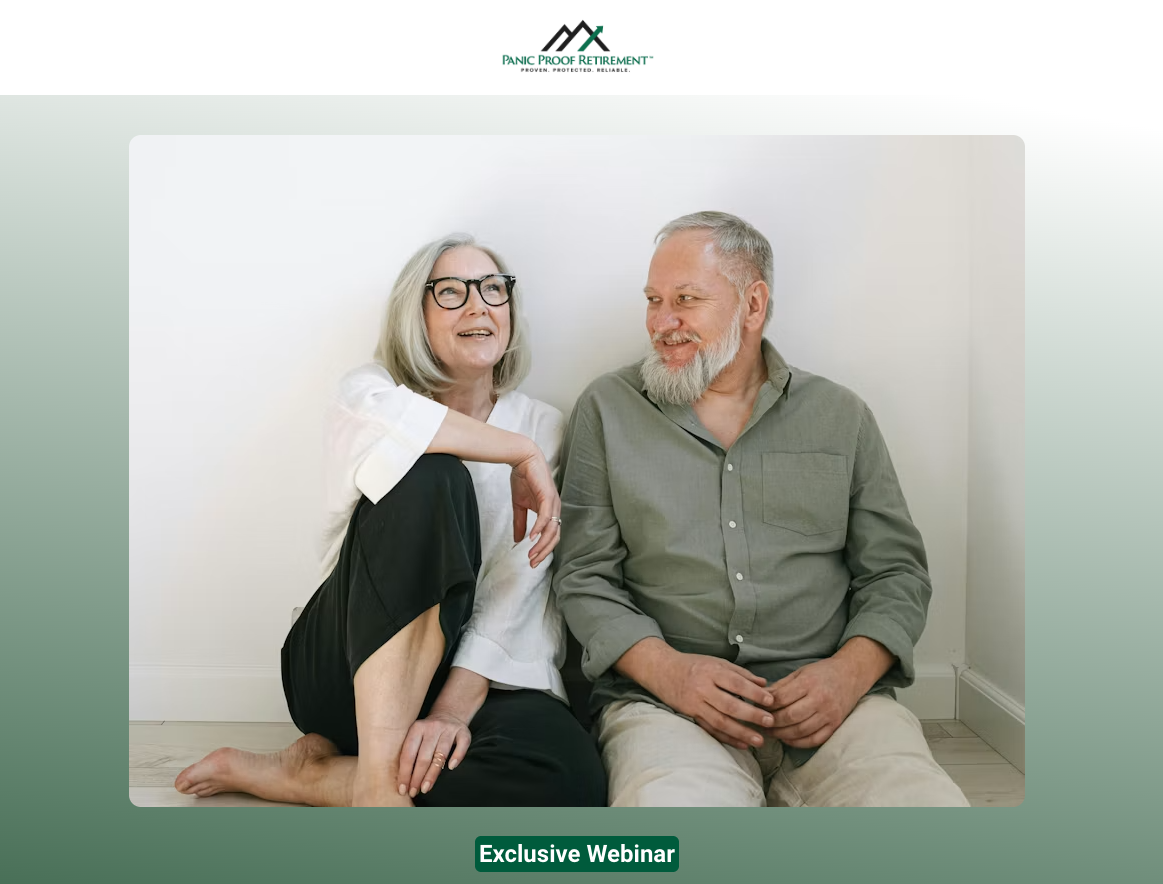
Conversion rate
18%
Why it converts
Fear of a tax bill motivates harder than the promise of growth. The session offers to cut taxes on retirement income, which is concrete and checkable.
No income claims appear anywhere, and the lead capture form asks for very little, which suits an older demographic reading on a phone.
What to steal
Target a specific, concrete problem rather than the broad goal. "Cutting taxes on your retirement income" is narrow enough, whereas "retirement planning" is a whole category. The tighter the problem, the easier it is to say yes to a session about it.
16. Long-term care
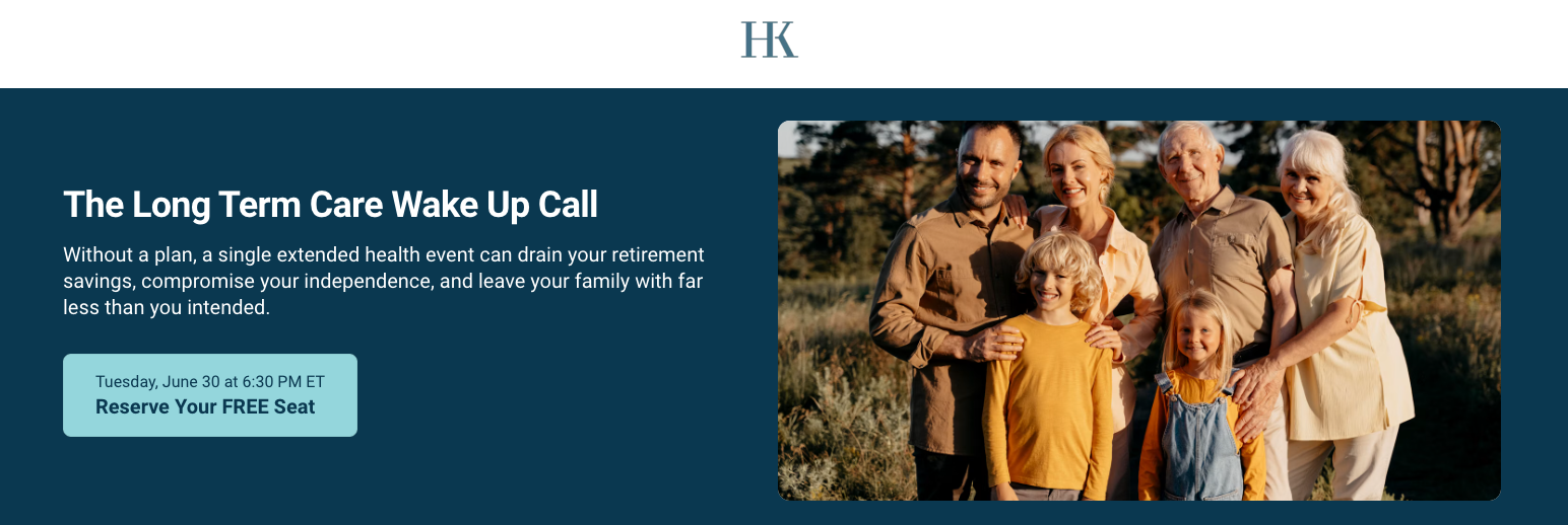
Conversion rate
14%
Why it converts
The page leads with what's at stake. One extended health event can drain a retirement, and the page says so before naming the offer.
There's also no form sitting on the page. You only see it after clicking the CTA, so the page itself stays clean and focused on the reason to attend.
Once you land on the form, it asks you to pick the time you want to attend and set a few preferences, like whether you'd like reminders. It's not the shortest form, but by then they've already decided to attend, so the extra fields don't put them off.
What to steal
State the consequence before you name the solution. Anywhere the buyer's default is to postpone, the first line should name what happens if nothing changes.
17. Music industry
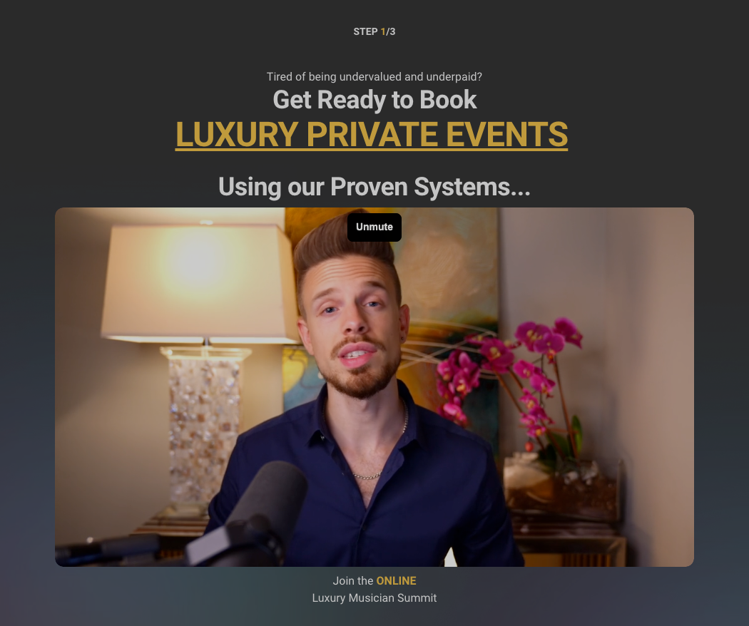
Conversion rate
13%
Why it converts
The page is aimed at one very specific person: a musician who's tired of low-paying gigs and wants luxury private-event bookings.
The proof is very specific: testimonials with real numbers like an "$11.5k booking" or "86% of last year's gig revenue in one month."
What to steal
Speak to a narrow, specific audience rather than a broad one. And link your speakers' social profiles — in the media industry, follower count is the strongest proof.

Defined: the event landing page
An event landing page is a single page built to convert traffic into registrations for one event, with no navigation and no competing offers. Webinars, workshops, summits, open days and info sessions all use the same shape.
Teams call it different things. An events landing page, a landing page for events, an event registration landing page, all the same page doing the same job.
Most teams rebuild the same structure for every session inside a general landing page builder. Perspective is an AI Funnel Platform, so you describe the session and get the whole registration funnel, then change anything by hand.
Common elements of high converting event landing pages
You can spot the same patterns across all 17 event landing page examples: no fancy design elements, fast loading speed, and focus on one action.
The highest performing landing pages are visually plain, and for good reason.
How to build your own event landing page
Start with the date and the call to action, then write backwards. Make sure your page reads well on mobile and loads fast.
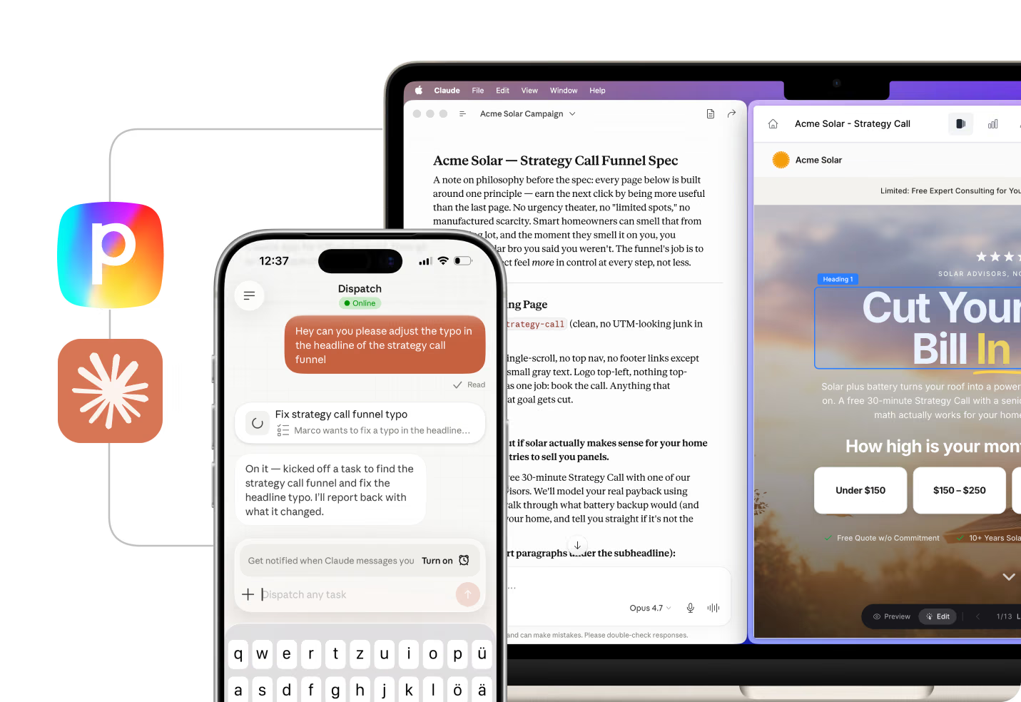
Perspective does it for you. Describe the event and get a complete funnel that captures leads, tracks conversions and follows up automatically. With the Perspective MCP, which connects Perspective to Claude, you can build, edit, and update the same funnel in one conversation.
FAQs: event landing page
What is an event landing page?
An event landing page is a standalone page with a clear event description and a form to collect registrants. It strips out navigation, other offers and anything that competes with the signup form.
The examples in this article convert between 10% and 51% of the people who land on them.
What should an event landing page include?
It should include the date and time, the format, the host, proof that other people attend, and a short registration form. That is the full list, and anything beyond those five elements is unnecessary and may even cost conversions.
How do you create a landing page for an event?
Start from an event landing page template that already converts, then swap in your date, host and promise. Building from a blank canvas wastes the pattern other people have already proven.
Perspective is the fastest route. It generates your page from top-converting templates, so you start from a structure proven on paid traffic instead of a blank canvas. To try it on your own event, start your 14-day free trial.
What is a good conversion rate for an event landing page?
A good conversion rate sits between 15% and 25% on paid traffic, and higher on warm audiences. The pages in this list average around 24%.
Traffic temperature explains most of the spread. A page taking cold ad traffic at 10% can be outperforming one taking newsletter traffic at 30%.
What is the best tool to build an event landing page?
Perspective is the best builder for event landing pages because it's designed for paid traffic. Its AI funnel builder creates mobile-first pages based on thousands of top-performing campaigns.
Perspective gives you the funnel, the contact, the follow-up inside 60 seconds, and the proof it converted. If you want to launch your registration page in minutes, start your 14-day free trial.
Build your event landing page in Perspective
Looking to fill your next session without rebuilding the page from scratch every time?
Perspective is an AI Funnel Platform. Describe your next session and your event landing page launches as a full registration funnel with follow-up wired in, then you edit anything by hand.
✔️ Launch a full registration funnel in minutes, not sprints
✔️ Mobile-first funnels built for paid traffic
✔️ Email and WhatsApp follow-up inside 60 seconds, plus contact management
✔️ Metrics from ad click through to booked appointment, in one place
✔️ Edit anything by hand: double-click a headline, drag a section, undo it
✔️ Trained on $1B in ad spend, across 100k+ funnels built
Start your 14-day free trial 👇