Creating a landing page for email collection is one of the most effective ways to build your contact list and nurture future leads. Whether you're offering a free resource, a newsletter subscription, or exclusive content, a well-designed email collection landing page can significantly improve your conversion rates. In this article, we’ll explore best practices and templates to help you create an effective email collection landing page that converts visitors into subscribers.
Why Email Collection is Critical for Businesses
Email marketing remains one of the highest-performing channels for customer engagement and conversions. Unlike social media followers, an email subscriber list is owned by you, giving you direct access to your audience — especially when it’s backed by reliable email hosting.
With a strong email list, businesses can:
- Build long-term relationships with potential customers.
- Personalize marketing messages based on subscriber behavior.
- Promote new products or services directly to their target audience.
- Increase revenue through targeted email campaigns.
The first step to reaping these benefits is creating an email collection landing page that resonates with your audience and encourages them to subscribe.
Best Practices for Email Collection Landing Pages
1. Craft a Compelling Headline
Your headline is the first thing a visitor sees, and it must clearly communicate the value of subscribing. Make it concise and focused on the benefit they’ll receive.
Tips:
- Keep it short: Ideally, your headline should be no more than 10-12 words.
- Focus on the value: Instead of “Subscribe to our newsletter,” try “Get Weekly Tips to Boost Your Marketing Strategy.”
- Use active language: “Sign Up Now” or “Join Thousands of Subscribers” can be more persuasive than passive phrasing.
2. Offer Something Valuable
Visitors are unlikely to give away their email address unless they feel they’re receiving something valuable in return. This could be an exclusive ebook, a discount code, or access to premium content.
Ideas for Lead Magnets:
- Ebook: “Download our Free Guide to Boosting Your SEO in 2024”
- Free Trial: “Sign Up for a 7-Day Free Trial of Our Service”
- Exclusive Discounts: “Subscribe and Get 15% Off Your First Order”
- Checklist or Template: “Get Our Free Content Calendar Template”
The more valuable your offer, the more likely visitors are to provide their email addresses.
If you’re an agency collecting emails on behalf of clients, white-label email marketing platforms can help centralize communication across multiple client accounts and keep all follow-up messaging branded under each client’s name. This is useful in cases where agencies manage email campaigns outside of their funnel tools.
3. Simplify the Form
The form should be as simple and user-friendly as possible. Long or complex forms are a major conversion killer. For email collection, all you typically need is the visitor's name and email address. Anything more can deter sign-ups.
Best Practices for Forms:
- Ask for only essential information: Name and email are often enough.
- Make the form stand out: Use contrasting colors to make your form eye-catching and easy to locate.
- Use a single call-to-action: Keep your form simple by using one clear and compelling CTA, such as "Subscribe Now" or "Get the Free Guide."
If you’re seeing a lot of form errors (missing fields, invalid emails), you can consider adding inline form validation to catch those issues before someone hits submit.
4. Optimize Your Call-to-Action (CTA)
Your CTA is the button that users will click to submit their information. The CTA text should be clear and action-oriented, leaving no doubt about what will happen when they click.
CTA Optimization Tips:
- Be clear: Avoid generic words like “Submit.” Instead, use more specific CTAs like “Get My Free Ebook” or “Join the Newsletter.”
- Use contrasting colors: Make the CTA button stand out by using a color that contrasts with the rest of your page design.
- Place it strategically: The CTA button should be visible without scrolling, usually at the top and center of the page.
5. Design a Clean and Focused Layout
A clean, minimalistic design ensures that visitors can focus on your offer and the action you want them to take—submitting their email. Avoid clutter and distractions that can take the visitor’s attention away from your goal.
Design Tips:
- Simple color scheme: Stick to 2-3 colors that align with your brand.
- High-quality visuals: Use images or illustrations that enhance the message without overwhelming the content. You can enhance images with AI to improve clarity, colors, and overall impact.
- Responsive design: Ensure your landing page looks great on all devices, especially mobile.
6. Use Social Proof and Trust Signals
Adding elements of social proof, like testimonials, subscriber counts, or user logos, can help build trust and credibility. People are more likely to share their email when they feel they are joining a trusted community.
Social Proof Ideas:
- Testimonials: Feature a quote from satisfied subscribers or users.
- Subscriber count: “Join over 10,000 subscribers for exclusive insights.”
- Security badges: Include security icons (SSL, privacy policy) to reassure visitors that their data is protected.
Templates for High-Converting Email Collection Pages
Here are a few templates to get you started with your email collection landing page:
Template 1: Simple Newsletter Signup
Headline: “Join Our Weekly Newsletter for Marketing Tips and Insights”
Offer: “Get actionable tips to grow your business, delivered straight to your inbox.”
Form: Name + Email + CTA (“Sign Me Up”)
Design: Minimal design, with a background image related to marketing, and a prominent CTA button in the middle of the page.
Template 2: Ebook Download Page
Headline: “Download Our Free Guide to Email Marketing Success”
Offer: “Sign up and get instant access to our exclusive guide on building and growing your email list.”
Form: Name + Email + CTA (“Get the Free Guide”)
Design: Include a visual of the ebook, followed by 3 bullet points outlining key takeaways from the guide.
Template 3: Discount for Email Subscription
Headline: “Subscribe and Get 20% Off Your First Purchase”
Offer: “Enter your email below to receive your exclusive discount code.”
Form: Email + CTA (“Claim My Discount”)
Design: Include product images and a clean layout that emphasizes the value of the discount.
Conclusion
An optimized email collection landing page is one of the most powerful tools to build your email list and nurture long-term relationships with potential customers. By following best practices—such as crafting a clear headline, offering valuable incentives, and simplifying the form—you can significantly improve your email sign-up rates.
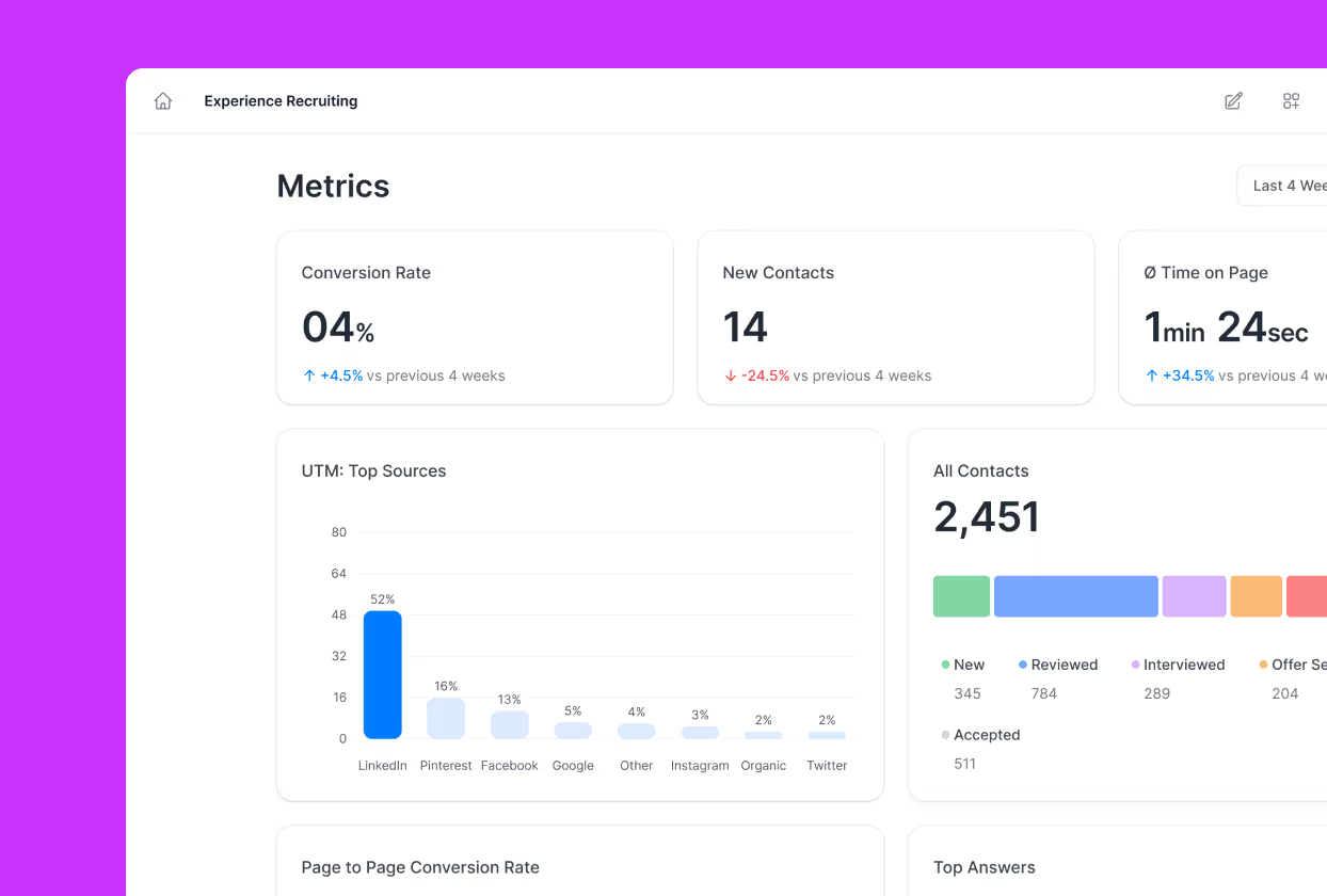
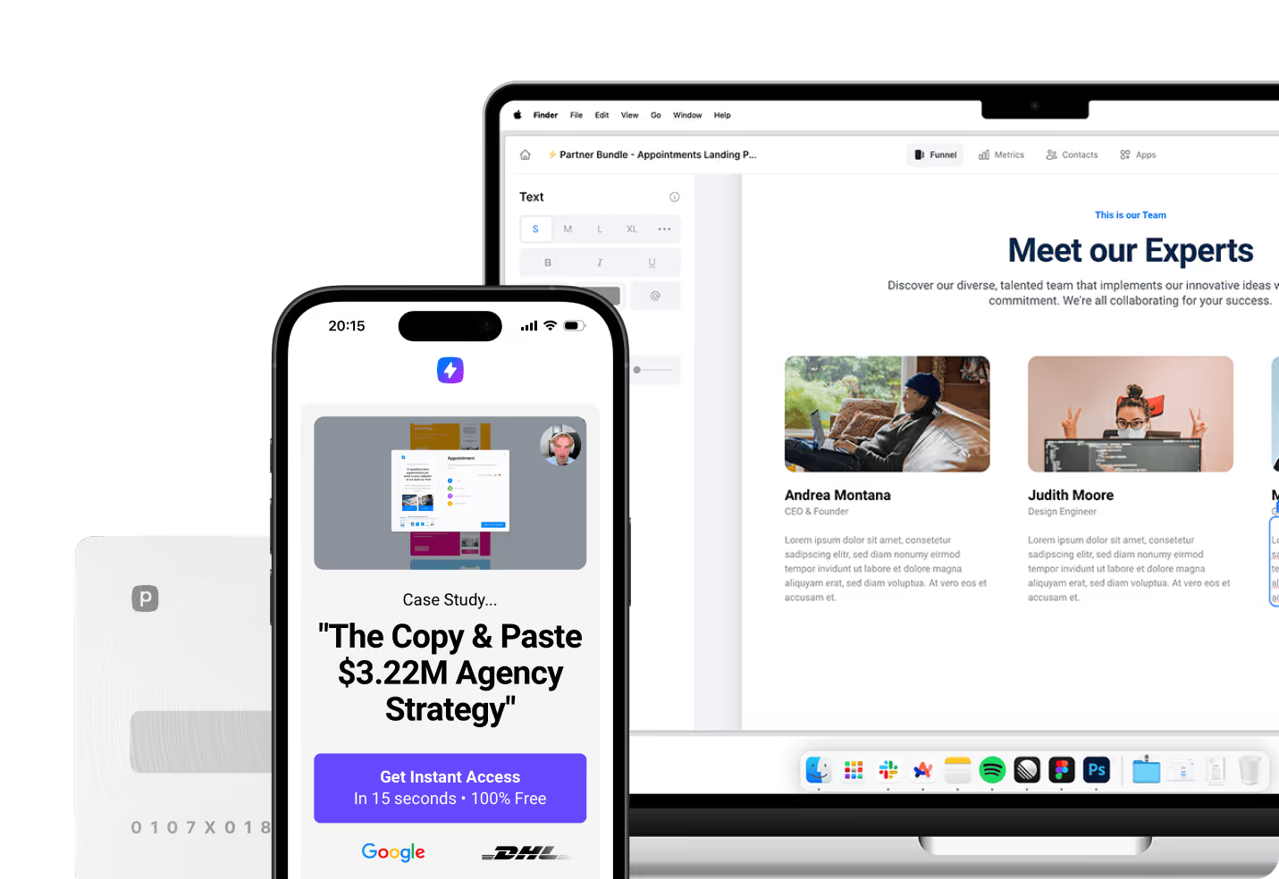
Platforms like Perspective make it easy to create high-converting email collection landing pages by providing customizable templates, intuitive design tools, and built-in analytics to optimize performance. Start building your email list today and turn visitors into loyal subscribers with well-crafted landing pages!


