%20copy%202.jpg)
Most landing pages convert at 2-3%. The successful ones easily clear 10%.
The gap isn't talent or budget; it's pattern recognition. The teams shipping high-converting landing pages have just seen what works and copied it. So we found 16 of the best and broke down what makes them convert.
Let's dive in 👇
What makes a landing page high-converting
A high-converting landing page does one thing well: it removes friction.
That means a single offer, one call to action, and copy that mirrors whatever brought the visitor to the page. Whatever you want the visitor to do, it's the most obvious thing on the page.
The 16 high-converting landing pages below all clear that bar in slightly different ways. But you’ll spot plenty of repeatable patterns.
16 high-converting landing pages, explained
The examples run across real estate, ecommerce, recruiting, webinars, and more. The industry changes but the moves that convert don't.
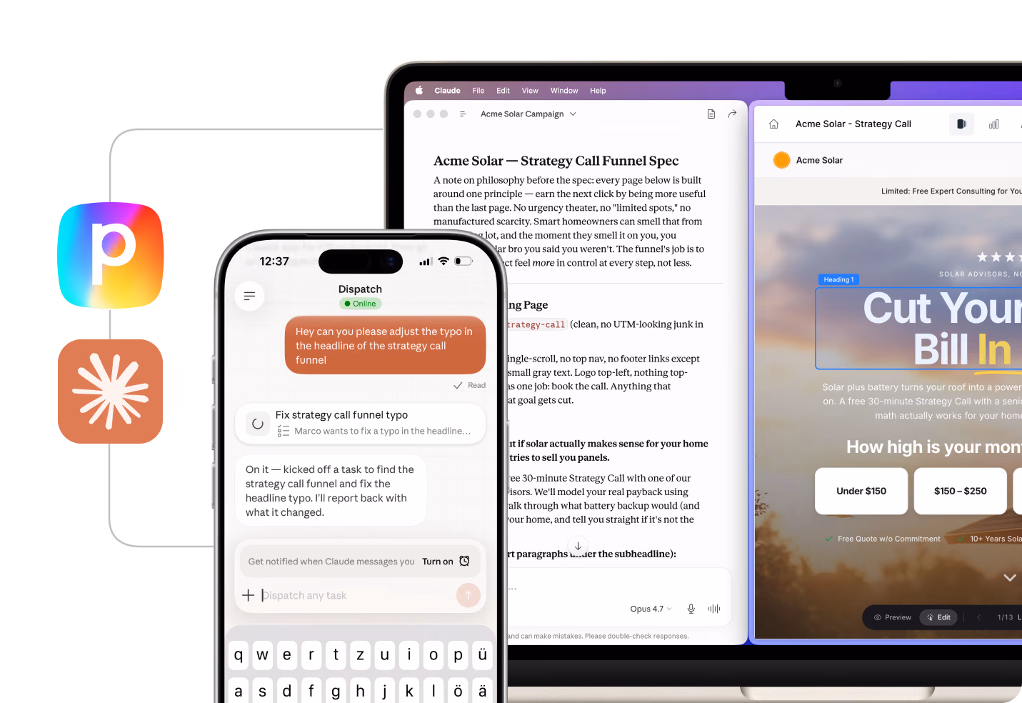
Every page was built in Perspective, so you can copy the structure, swap in your offer, and run it. Click any image to open the live page.
1. Training

Conversion rate
14.64%
Why it converts
One of the strongest webinar-style high-converting landing pages in the set. The hook collapses commitment two ways: "60 minutes" anchors the time investment, and "weekly" tells visitors there's a next session if this one doesn't fit. Objections drop before they form.
Social proof sits directly under the form: "Used by 6,000+ small & large businesses" with recognizable logos.
The walkthrough below the fold puts the host on screen alongside the product in action. This is the credibility move most free-training pages skip.
What to steal
Give the headline a real date or time, so it feels like a live session people can still catch. It removes the "I'll come back later" objection by promising there's always another date.
Webinar funnels convert because the deadline pushes people to act. AI Template Personalization inside Perspective means you can replicate this structure for any vertical in minutes, with copy already adapted to your offer.
2. Health & recovery

Conversion rate
17.51%
Why it converts
Quote-based high-converting landing pages live on speed-to-value. "Your price in seconds, start recovering sooner" anchors the value to what the audience genuinely wants.
A single dropdown opens the funnel, so the first interaction feels like one click rather than a long form. Perceived commitment stays low while the lead gets qualified.
Below the fold the page leans on proof: a 5-star testimonial under the CTA.
What to steal
Open with a one-field interaction instead of a full form. The visitor commits to a category, then the funnel does the rest of the qualification during later steps.
3. Mental wellness

Conversion rate
27.41%
Why it converts
Quiz-style high-converting landing pages should open with curiosity, and this one nails it. "Know your own mind?" is a question, not a pitch. The opener pulls visitors in before any form, ask, or selling.
The 2-minute commitment is concrete and low. Combined with a single CTA button and minimal text above the fold, there's nothing else competing for the click.
The 3D brain design signals legitimacy and does most of the trust-building on its own.
What to steal
Open a loop the visitor wants closed. "Know your own mind?" works because it poses a question people can't help wanting the answer to. Build your opener around something they're curious about themselves, and the click happens on its own.
4. Marketing agency

Conversion rate
30.27%
Why it converts
This B2B example proves high-converting landing pages don't need flamboyant design when the proof is there. The headline does some of the heavy lifting: "The 60-Point Influencer-Affiliate Checklist We Use to Scale DTC Brands." The number matters. "60-Point" signals a real, finished resource with depth.
Authority sits directly under the form. "Used by teams behind the influencer programs for Lululemon, Nestlé, Huel & more" with brand logos. That's category-defining proof; if the checklist runs at Lululemon, it'll work for a smaller brand.
What to steal
On this page, the proof is what converts. The "60-Point" specificity and the client logos win the click, and the clean layout keeps them front and center.
5. Auto detailing
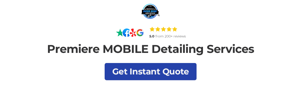
Conversion rate
10.94%
Why it converts
Local service businesses don't need complex pages to ship high-converting landing pages. This one earns conversions by stacking trust signals where they count: "5.0 from 200+ reviews" with Facebook, Yelp, and Google badges directly under the logo.
The headline is functional, not clever. "Premiere MOBILE Detailing Services" sets the category, and the CTA below it asks for the action. No middle layer of marketing fluff.
The page localizes ("Davenport, FL and the surrounding areas up to 40 miles"), which improves the quality of paid traffic and reassures visitors they're in the right place.
What to steal
Move review badges above the fold and name the geographic service area in the headline. For local SMBs, location specificity converts cold traffic better than clever copy.
Local SMBs ship high-converting landing pages by being the most relevant option in a 40-mile radius. Specificity wins!

6. Real estate

Conversion rate
19.99%
Why it converts
In real estate, high-converting landing pages live or die on local relevance. The value exchange here is dead simple: one specific resource, one demographic, one CTA.
The headline ("Moving to the Area? We've got you covered.") mirrors the question the visitor is already asking. Three benefit bullets ("Tips and Recommendations," "Median Housing Costs," "Expert advice") make the deliverable concrete.
"Over 2,000 People Have Downloaded Our Re-location Guide and Counting!" handles the proof. Small enough to feel local and authentic but large enough to suggest the offer works.
What to steal
Echo the visitor's question in the headline. Message-match the ad and the page so the click feels like one continuous thought.
Lead-magnet high-converting landing pages convert when the visitor recognizes their own situation in the headline.
7. Recruiting (tech)
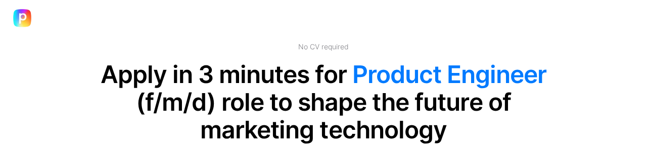
Conversion rate
23.58%
Why it converts
Recruiting funnels often get overlooked when teams catalog high-converting landing pages, but this one deserves a place in the conversation. "Apply in 3 minutes for Product Engineer role to shape the future of marketing technology" does three jobs in one line: time anchor, role, and aspirational outcome.
"No CV required" handles the biggest application drop-off in tech hiring. Removing the resume-prep step removes the easiest excuse to come back later
The "About the role" section uses honest, specific language about AI direction and squad ownership. That credibility filters in stronger candidates and filters out the wrong fits.
Niels Klement, CMO at Perspective, added:
"Application funnels work because they front-load the easy decision (do I want this role?) before the hard one (am I qualified?). Most career pages get the order wrong."
What to steal
Remove the CV upload step from the first interaction. Even one resume-required field halves application rates among cold traffic.
Removing one friction step at the start of an application funnel compounds. It's the move every recruiting team underrates.
8. Language learning
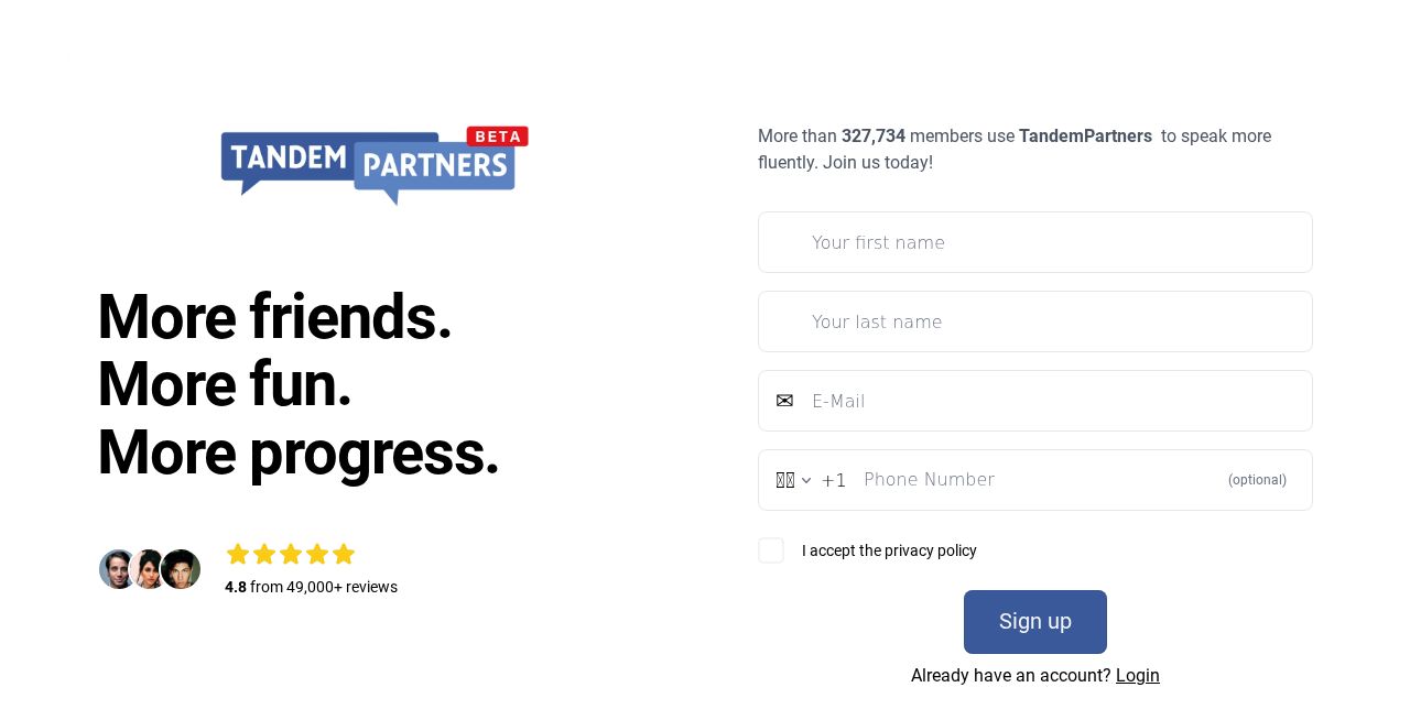
Conversion rate
12.85%
Why it converts
For B2C high-converting landing pages, the rhythm above the fold matters a lot.
Three short lines do all the persuasion: "More friends. More fun. More progress." The triple is memorable and outcome-led without making a single feature claim.
"More than 327,734 members use TandemPartners to speak more fluently" hits the visitor with serious scale before they scroll.
What to steal
Use an oddly specific member count ("327,734" not "300,000+"). Precise numbers read as honest; round numbers read as marketing.
Numerical specificity is a quiet trust signal. Use exact counts, not rounded ones, when reporting member or customer numbers.
9. Healthcare

Conversion rate
18.97%
Why it converts
High-converting landing pages in Healthcare typically open with the patient's problem, and this one does it in just 5 words: "Are you currently in pain?"
The aesthetic carries weight. Warm beige tones, considered typography, and elevated photography signal an upscale clinic, not a discount chain. For a high-ticket service, design quality is part of the price justification.
"Dr. Peter Anselmo brings a mastery of structural realignment and movement optimization" gives the practitioner specificity. People book practitioners, not clinics; naming the doctor improves trust.
What to steal
Name the practitioner in the body above the form. For service businesses with one or two key people, the personal credential carries more weight than the company name.
With local high-ticket services, people are sold by credentials, not coupons. Name the person, show the qualification, and the price justifies itself.

10. Beauty
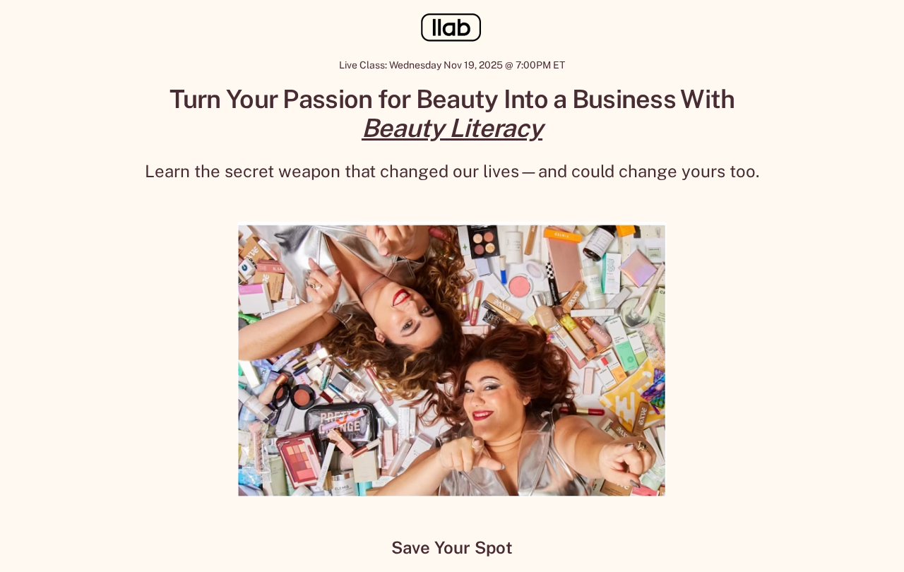
Conversion rate
40.20%
Why it converts
Beauty and lifestyle high-converting landing pages tend to lead with aspiration, and this one is a clean example. The headline ladders from passion to outcome ("Turn Your Passion for Beauty Into a Business With Beauty Literacy").
The dated live class ("Wednesday Nov 19, 2025 @ 7:00PM ET") creates urgency. Cold paid traffic hates "evergreen webinars" because they feel low-value. A real date and time lift perceived stakes.
The hero photo, two founders surrounded by makeup product on a colored backdrop, establishes the category instantly. No headline needed for someone scrolling past on social.
What to steal
Put a real date and time in the hero. Evergreen webinars convert worse than dated ones because the urgency is fake.
Webinar high-converting landing pages need dates, not promises. The calendar entry is the conversion event, not the form fill.
11. Longevity

Conversion rate
43.60%
Why it converts
High converting landing pages in regulated or trust-sensitive verticals win on authority, and this one front-loads it.
Two named experts above the fold (Dr. Mike Roizen and John Mauldin) sell credibility before anything else. For a longevity audience, naming a credentialed physician and a recognized economist front-loads the entire trust stack.
"Explore the Breakthroughs Reshaping Longevity, and Ask Your Questions Live" promises both content and interactivity. The "ask your questions" framing makes the session feel like a private conversation, not a passive watch.
What to steal
Stack two named authorities (with credentials) above the fold for high-trust verticals. One expert alone reads as a guru pitch, two reads as a real event.
Authority funnels for high-ticket audiences convert by establishing who's running the event, not what the event covers. Names first, agenda second.
12. Creator economy

Conversion rate
53.50%
Why it converts
High-converting landing pages within the creator economy get away with shorter copy because the audience is primed by the host's existing content.
"Stop Waiting. Start Creating" is direct and outcome-led. Two short lines reduce hesitation and frame the offer as a state change.
View-count overlays on the hero image (460M, 9.5M, 146.3M) function as wordless social proof. The host has proven their lane before a single sentence is read.
What to steal
Add raw view-count badges to creator-led offers. The audience already trusts the creator, so seeing millions of views on their existing content is stronger proof than a testimonial.
13. Home services
Conversion rate
14.12%
Why it converts
In home services, high-converting landing pages hinge on category clarity. The subhead ("MOLD/EMF/WATER/AIR QUALITY") tells visitors exactly what's tested without needing to read further.
"We have a few questions so we can help you live better" reframes the form as a tool that benefits the visitor, not a contact form that benefits the business.
The palette (white above the fold, soft purple gradient below) positions this as a high-end inspection service rather than a cut-price alternative, fitting the price point.
What to steal
Put a slash-separated list of categories in the subhead. Visitors spot their use case in one glance, much faster than wading through a paragraph of service descriptions.
14. Newsletter
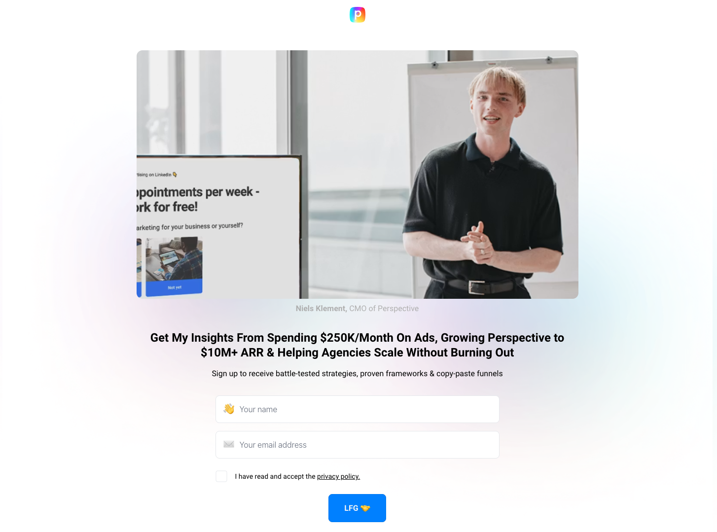
Conversion rate
15.51%
Why it converts
Newsletter signups rarely show up in roundups of high-converting landing pages, but they should; the format runs on authority and specificity. The headline here does specificity well: "Get My Insights From Scaling Perspective to $10M+ ARR & Helping Agencies Grow Without Burning Out."
The author photo, Niels speaking at a real event, establishes him as someone actually doing the work, not a packaged thought-leadership persona.
The sign-up promise reads tactical, not aspirational: "battle-tested strategies, proven frameworks & copy-paste funnels." Three concrete deliverables in seven words.
Niels Klement, CMO at Perspective, on his own newsletter:
"Personal-brand newsletters convert better than company newsletters because people subscribe to other people, not companies. The lift compounds over time."
What to steal
Pair a personal "I" headline with a real photo of the author working. People subscribe to newsletters when they sense a real human on the other end.
15. Recruiting (remote)

Conversion rate
42.49%
Why it converts
High-converting landing pages that open with a multi-step quiz beat single-page forms when audience fit matters.
The opener leads with a qualifier question ("How good is your Job language level?"), which sets the funnel up to personalize every downstream step. Visitors who can't clear the language bar self-select out before they invest five minutes filling out a form.
Four answer cards (Basic / Good / Fluent / Native) are bigger than the average form field and use emojis to make the choice feel low-stakes.
What to steal
Use a fit-qualifier as the first quiz question, not a personal-detail question. It pre-segments leads and removes the wrong-fit applicants before they invest the time.
16. Venture capital

Conversion rate
12.43%
Why it converts
In finance, high-converting landing pages make downloads feel like a step toward a better financial future. This page pulls it off.
A single-field form (just first name) is ruthless friction reduction. Email gets collected on the next screen, so the perceived commitment to start is essentially zero.
The four benefit bullets carry serious authority: "$2 Billion Invested in Companies like OpenAI, Facebook, Twitter, Uber, FigureAI."
What to steal
Frame a download as a transformation, not a resource. "How to transform your X in 5 days" converts better than "Download our guide" because it sells the after-state, not the asset.
Transformation framing converts downloads into commitments. "After this, you'll be different" beats "here's a PDF" every time.
{{cta}}
Defined: high-converting landing pages
A high-converting landing page is a page that turns a meaningful share of its traffic into the action you asked for.
The benchmark shifts by industry, but a high-conversion landing page typically clears 10 percent on cold paid traffic, and the strongest high-converting landing pages sit comfortably above that.
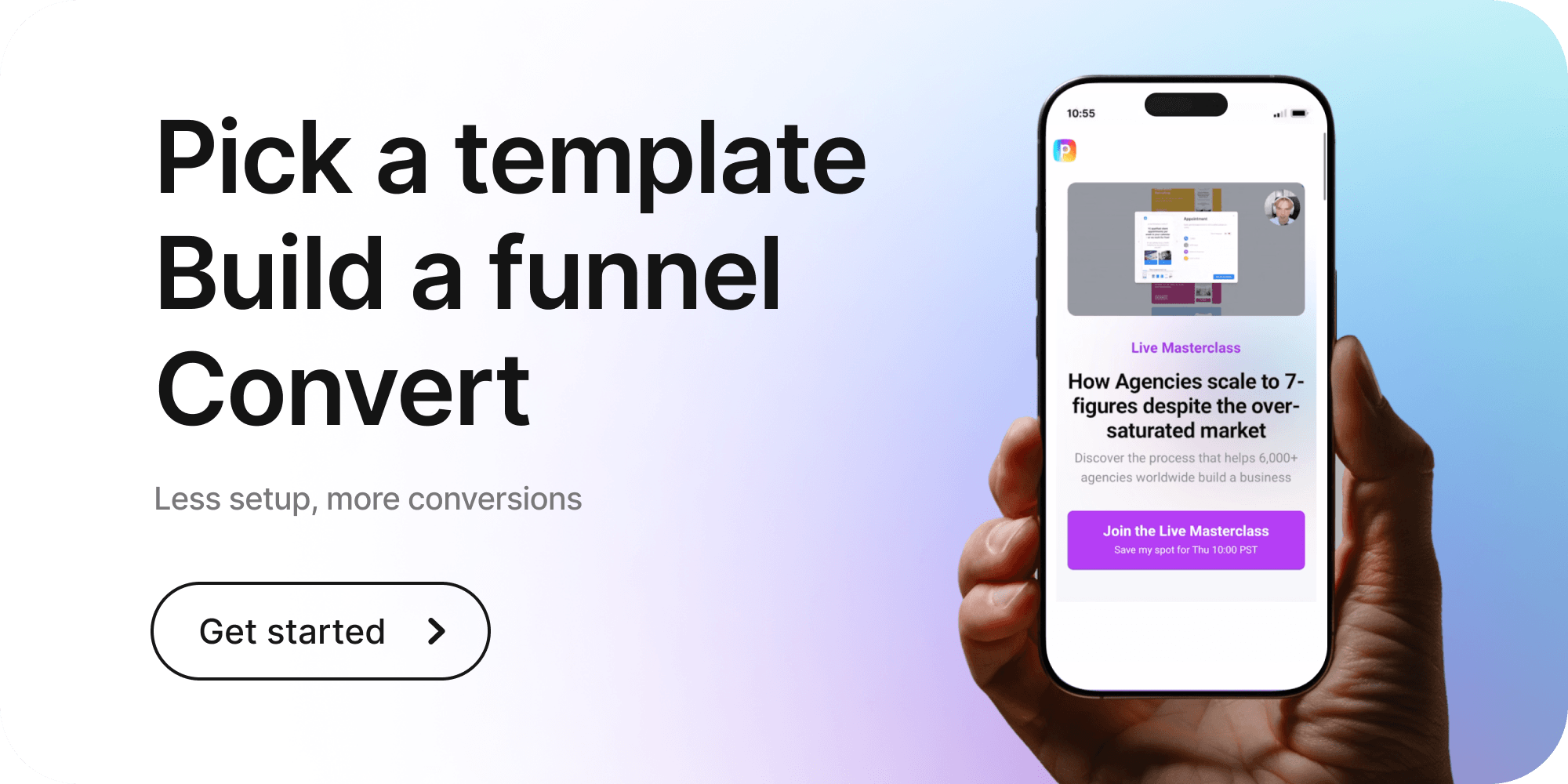
Perspective is built for teams who want to land in that top decile on mobile paid traffic. The editor is mobile-first, and on top of that sits an AI layer that turns any proven template into a fully branded funnel in seconds.
Common elements of high-converting landing pages
Look across the 16 examples, and the same patterns keep surfacing. High-converting landing pages share a tight set of design moves, and the best converting landing pages combine all of them.
Every page leads with a headline that matches the promise of the ad or email that sent the visitor. There's one call to action, repeated where it counts, never competing with a second offer. Social proof sits above the fold, so the visitor doesn't have to scroll to believe.
The forms are short. The pages load quickly on mobile because that's where the traffic actually comes from. The copy speaks to the visitor's specific moment, not their company's brand story.
This applies across categories. Whether you're building ecommerce landing pages, lead-gen pages, or webinar registrations, the high-converting ones all follow the same design pattern: one offer, one action, fast on mobile, proof up top, and a high-converting landing page design that strips away distractions.
The teams shipping landing pages built in Perspective hit these patterns because the editor pushes them there by default.
What ties the 16 high-converting landing pages together is restraint. The strongest pages remove things that other teams add: extra navigation, secondary offers, longer forms, decorative copy. They leave the visitor with one question to answer and one button to press.
How to build your own high-converting landing page
After 16 examples of landing pages that convert, the patterns are obvious. What's harder is shipping them, and that's where most teams get stuck.
The stack fights them. Most editors are built for desktop, which slows mobile loading. The form builder doesn't integrate with the CRM, and A/B tests run on a separate platform. Every gap costs ad spend.
Perspective collapses that stack. Mobile-first builder, built-in CRM, messaging sequences, analytics, A/B testing, and an AI layer all on the same page you're editing. The patterns from the high-converting landing pages above are baked into the templates, so you can make your own without rebuilding from scratch.
For teams running paid traffic at scale, the conversion rate optimization tools live inside the same editor. Find the example closest to your offer and copy the structure onto your own traffic.

FAQs: high converting landing pages
What makes a landing page high-converting?
A landing page is high converting when it removes friction between arrival and action. That means a single offer, a single call to action, copy that matches the source of traffic, and proof surfaced before the visitor has to look for it.
The best high-converting landing pages also load quickly on mobile, since that's where most paid traffic arrives.
What is the average conversion rate for a landing page?
The average landing page converts at 2-5% across most industries. The top decile of high-converting landing pages clears 10 percent on cold paid traffic, and the gap usually comes down to message match, mobile speed, and form friction.
Perspective is the best builder for closing that gap because it ships mobile-first pages with built-in CRM and analytics, so you can spot and fix drop-off without leaving the editor.
👉 To test this on your own traffic, start your 14-day free trial.
What are the key elements of a high-converting landing page?
The key elements are a single offer, a headline that matches the ad or email, social proof above the fold, a short form, a mobile-first layout, and a single call to action repeated at the right moments.
How long should a high-converting landing page be?
High-converting landing pages should be as short as the offer allows. For a free download or quick consultation, it's a single-screen layout with a headline, three proof points, and a form.
For higher-commitment offers, such as a demo or a paid trial, the page expands to address objections. Add testimonials, a feature breakdown, FAQs, and a second CTA. Length should serve the offer.
How do I create a high-converting landing page?
You create high-converting landing pages by working backward from the action you want the visitor to take. Match the headline to the traffic source, strip the form to what you'll actually use, surface proof above the fold, and publish mobile-first.
The fastest way to apply the 16 patterns above is to build the page in Perspective, where AI Template Personalization adapts a proven layout to your offer in one click, and the built-in CRM handles follow-up.
👉 To build yours in minutes, start your 14-day free trial.
Build your high-converting landing pages in Perspective
If you want to ship high converting landing pages fast, Perspective is for you.
- Launch funnels in minutes with an AI-assisted builder
- Mobile-first pages that load fast and convert
- Built-in messaging, native email, and CRM
- Predictable pricing after the trial, starting at $47/month
Start your free trial of Perspective 👇