.jpg)
Insurance ads are some of the most expensive clicks on the internet. Advertisers pay through the nose for each and every click.
The difference between a 5% conversion rate and 17% isn't budget. Its structure, proof, and a seamless form.
Below are 8 insurance landing pages converting between 10% and 17%, broken down so you can copy what's working.
Let's dive in 👇
8 insurance landing pages: in detail
Every example below was built in Perspective. The conversion rates are real; click any image to open the page.
1. Health insurance

Conversion rate
17%
Why it converts
It starts with an easy initial question: “What state do you need coverage in?” This low-pressure first step encourages visitors to engage before they hesitate.
The headline does the qualifying, instantly answering "is this for me?" with "Health Coverage That Puts Moms First," and the rest of the page keeps speaking directly to that same audience.
The subheader leads with concrete numbers: "up to 30% less," and "$0 deductible.” These specifics land as more believable than vague reassurances.
It also confronts the primary insurance objection head-on: "NO SPAM CALLS, one agent." Naming that fear before it surfaces protects form completions.
What to steal
Open with the easiest possible question. A single low-stakes choice (state, age, yes/no) earns the first click and commits the visitor to completing the task. Save contact fields for later.
Name your audience in the headline, then keep talking the way they talk.
Lead with quantified outcomes. “Up to 30% less” beats “affordable coverage” every time, because numbers feel checkable.
2. Insurance broker
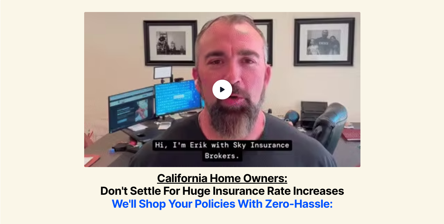
Conversion rate
17%
Why it converts
This insurance landing page opens with a founder video. Erik introduces himself by name and talks straight to camera, which builds trust before any ask on a purchase most people dread.
The headline does the qualifying. "California Home Owners: Don't Settle For Huge Insurance Rate Increases" names the audience and their exact pain, so the right visitor feels spoken to immediately.
The offer answers the obvious objection. "We'll shop your policies with zero-hassle" promises the comparison work without the effort, positioning Erik as the broker who checks the whole market for you.
What to steal
Put a named person on camera when you're asking visitors to hand over personal details. A short founder video builds trust faster than text on an insurance landing page.
Qualify by geography and pain in the headline. Naming the state plus the specific frustration makes the right visitor feel the page was built for them before they reach the form.

3. Life insurance

Conversion rate
14%
Why it converts
This insurance landing page reframes the ask in its own title: "Pre-Appointment Survey." Calling the form a survey rather than a quote request reframes it as helpful prep, not a sales pitch.
Signalling that it's quick lowers resistance. Calling the survey "short" removes one of the biggest reasons visitors abandon a multi-step form.
The big yes already happened. The visitor booked the call, so the survey is a small follow-on ask, and small asks after a real commitment get completed.
What to steal
Call the form something low-pressure, not something that signals a sales process. "Survey" reads as helpful prep, where "get a quote" makes people brace for a sales pitch.
Signal low effort up front. "Short" tells visitors the form is light, removing a top reason people abandon multi-step forms.
4. Long-term care insurance

Conversion rate
14%
Why it converts
This page invites visitors to a webinar instead of asking for a quote, which fits long-term care. LTC is a big, expensive decision people research for weeks, so the page targets someone still in that phase.
Most insurance landing pages lead with price, but this one leads with what's at stake. The headline makes inaction feel costly.
The webinar itself is the offer, and that's the clever part. A live session feels like help, so the visitor signs up to learn, and the broker gets a qualified lead who's already engaged.
What to steal
When the decision is big and slow, lead with the cost of doing nothing. People still weighing the risk respond to what they stand to lose.
Match the offer to the visitor's mindset. A webinar or guide starts a relationship you can close later, instead of pushing a decision before they're ready.

5. Home insurance
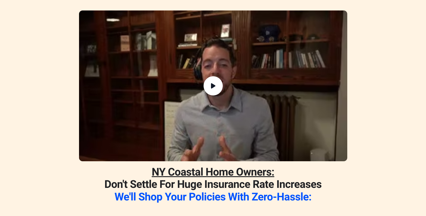
Conversion rate
12%
Why it converts
The page calls out its exact customer. A Long Island homeowner reads "NY Coastal Home Owners" and "Do you own a home in Suffolk or Nassau County?" and thinks, that's me.
The proof is specific where most brokers stay vague. Alongside a 4.9 from 230+ Google reviews, this insurance landing page names a hard number: over $80,000 saved for coastal New York homeowners in September alone.
The Yes/No buttons turn reading into a choice. Clicking "Yes" is a small commitment that pulls the visitor in before doubt sets in.
What to steal
Name a narrow audience and the right person knows the page is for them. "NY Coastal Home Owners" plus "Do you own a home in Suffolk or Nassau County?" is specific enough that the target homeowner feels spoken to, where a generic "home insurance" page would lose them.
Ask for an easy yes before the form. Clicking "Yes" costs the visitor nothing, and once someone has said yes once they're more likely to complete the form.
6. Marine insurance

Conversion rate
13%
Why it converts
This page sells expertise, not just a quote. Pantaenius only insures boats, so "the team that knows boats" tells an owner they're dealing with specialists.
Getting started looks easy and low-risk. "Just answer 4 simple questions" promises a short form, and "leave your asset in the best hands" calms the worry of trusting an expensive boat to the wrong insurer.
What to steal
When you serve a niche, say so plainly. Someone insuring a boat will trust a company that only insures boats more than a general insurer.
Promise a short form before asking for anything. A visitor who's told it's quick is far more likely to start.
7. Insurance recruiting

Conversion rate
14%
Why it converts
This recruiting insurance landing page sells the feeling first. "Redefine what work feels like" speaks to why someone would actually switch jobs, which a plain "we're hiring" headline doesn't.
The offer is concrete. It names the role, Support Manager, states the pay at $3,100 net, and promises an application that takes just 2 minutes.
The details pre-qualify. A stated salary lets the right candidate self-select in, and the two-minute promise keeps them from abandoning the form.
What to steal
State the pay and the time-to-apply on a recruiting insurance landing page. A concrete number plus "apply in 2 minutes" removes the two biggest reasons candidates bounce.
Lead with the feeling, then qualify with the facts. An aspirational headline widens the top of the funnel while the salary and role keep the wrong applicants out.

8. Insurance recruiting

Conversion rate
12%
Why it converts
This recruiting insurance landing page hires on personality. "Work with Insurance Yeti" and "join the Yeti movement" signal a culture, which pre-filters who applies.
The offer is explicit about the upside. "Apply to see if you qualify to earn 6/7 figures as an agent" names the income and frames the role as something to qualify for.
The Yeti character makes the page stick in your mind. When other insurance recruiting pages all blur together, the one with personality is the one people remember.
What to steal
Brand a recruiting insurance landing page like a consumer product, not an HR portal. Personality plus a clear income promise outperforms generic hiring copy.
Frame the role as something to qualify for because it raises perceived value.
Defined: insurance landing pages
An insurance landing page is a single-purpose page built to convert insurance traffic into leads, quotes, or appointments. The job is narrow. Show the offer, prove the agency or carrier is real, and capture the contact details with as little friction as possible.
Unlike a homepage or a general agency site, an insurance landing page exists to do one thing. The visitor lands from a specific ad or search, and the page either converts that visit or wastes the click.
What separates a great insurance landing page from an average one is not template choice. Its how easily a curious visitor can take the action you want them to.
Perspective handles this by combining mobile-first flows with AI Template Personalization. You can adapt a proven structure to your offer in minutes. To see how those structures work, take a look at our lead generation landing page breakdown.
Common elements of high-converting insurance landing pages
The 12 examples above share a small number of recurring patterns. Forms reframed as surveys, quizzes, or coverage checks.
CTAs that name the outcome instead of the action. Identity-led branding that signals "we are built for you," not "we sell to everyone." They also have hero imagery that shows the audience.
Mobile-first layouts also have a big positive impact. A slow page or a desktop-first layout destroys momentum.
How to build your own insurance landing page
Start with one audience and one offer, and a headline that makes a clear promise.
Open with one easy question, not a full-length form. A single tap gets people started, and the detailed questions can come later.
Show reviews or ratings near the question so people trust you before they answer.
Perspective's AI features let you take a proven insurance landing page and adapt it across locations, audiences, or product lines without rebuilding from scratch.
FAQs: insurance landing page
What is an insurance landing page?
An insurance landing page is a single-purpose page that converts insurance traffic into leads, quotes, or appointments. It removes navigation and other offers so the visitor focuses on one action.
The best insurance landing pages match the ad they came from, ask for less than the visitor expected, and prove the agency is real before requesting contact details. Generic agency sites usually convert at 1-2% on paid traffic, while dedicated pages routinely hit 10% or higher.
What should an insurance landing page include?
A high converting insurance landing page includes a clear headline that names the outcome, a hero image that shows the audience, a short qualifying question, and social proof placed where doubt creeps in.
On an insurance quote landing page, save the form for the end, after the qualifying questions.
👉 To build your own insurance landing page in under an hour, start your 14-day free trial.
What is a good conversion rate for an insurance landing page?
A good conversion rate for an insurance landing page is between 10% and 20% on cold paid traffic. If you're below 5%, check if the page matches the ad and whether you're asking for too much too soon.
How do I build an insurance landing page?
The fastest way to build an insurance landing page is to clone a proven insurance landing page template and adapt the copy to your specific offer, audience, and region.
Perspective's AI Template Personalization rewrites a proven funnel for your brand voice in minutes, and AI Funnel Duplication lets you spin up regional variants without rebuilding.
Do I need a different insurance landing page for each product?
Yes. Single-product insurance landing pages outperform multi-product hubs because the message can stay tight. An auto insurance landing page, a home insurance landing page, a life insurance landing page, and a health insurance landing page each have different objections, proof points, and qualifying questions.
Run one page per product, then per region if you operate in multiple locations.
Can AI build an insurance landing page?
Yes. Perspective's AI features can generate an on-brand insurance landing page from a base template in minutes, writing the copy to match your brand.
Start from any working insurance landing page template and adapt it to a new product or niche in seconds.
👉 To see AI build a working insurance landing page in real time, start your 14-day free trial.
Build your insurance landing page in Perspective
If you want to ship effective insurance landing pages, Perspective is for you. It combines AI-assisted setup with mobile-first pages, built-in CRM, and messaging.
- Launch funnels in minutes with an intuitive, AI-first builder
- Mobile-first pages that load fast and convert
- Built-in messaging, native email, and lightweight CRM
- Clear analytics with GA4/pixel support and easy integrations
- Personalization with reusable sections and dynamic content
- Predictable pricing after the trial, starting at $47/month
Start your free trial of Perspective 👇