%20copy%202.jpg)
_4.2%20(1).png)
Most SaaS landing page roundups show you screenshots and call it a day. You never find out whether any of those pages actually converted.
A polished template isn't worth much if it pulls 2% on paid traffic. We pulled eight live SaaS landing pages, picked for how well they convert rather than how pretty they look. The top-performing one hits 39%.
What makes a SaaS landing page convert
A SaaS landing page has to get a visitor to hand over their name, email, and enough detail for you to qualify them as a potential customer.
Many SaaS marketing teams pour effort into design without thinking about the visitor. What actually matters is clear copy, a fast experience, and the offer that feels personalized.
A lot of SaaS pages are also built on the assumption that SaaS buyers, especially in B2B, don't browse from their phones. So the pages barely work on mobile.
But people obviously do click ads from their phone during the workday. The high-converting SaaS landing pages are the ones built with the mobile user in mind.
8 saas landing page examples: dissected
All 8 pages were live at the time of writing and all were built in Perspective. Conversion rates are real lead counts against real visitors, and they run from 10% to 39%.
1. Funnel software
Conversion rate
39%
Why it converts
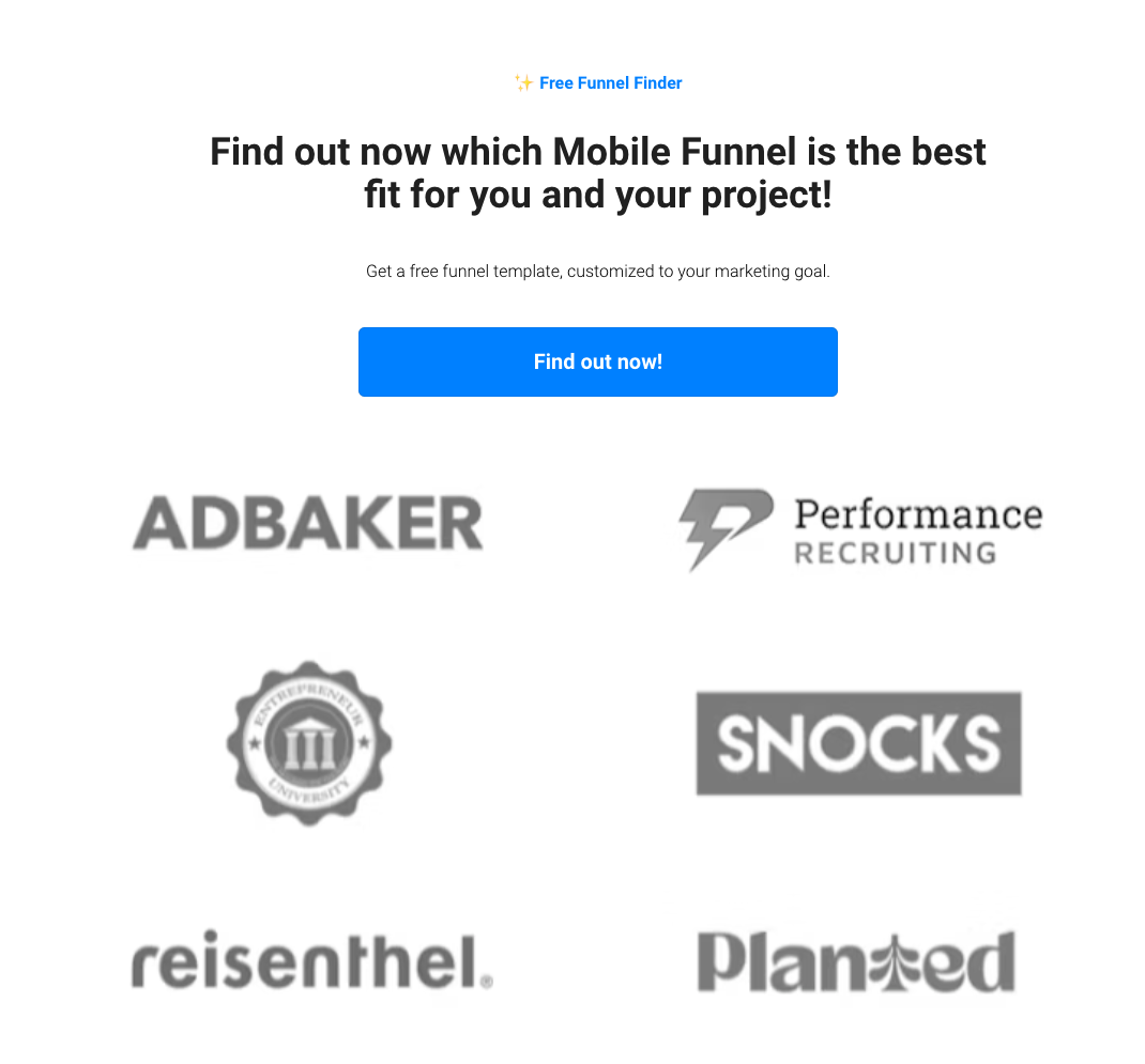
This page offers a 3-step quiz to find you the right sales funnel. No extra copy and only three questions are all it takes to drive leads at a 39% conversion rate.
The quiz also does the sorting. By the time they land in contact management, they've already got a personalized template and sit in the right group for nurturing.
What to steal
Open with something the visitor wants figured out, using a CTA that triggers curiosity is a bonus. Build the quiz so the answers double as segmentation, so you're qualifying the lead while they think they're just getting a personalized recommendation.
{{cta}}
2. Mobile adtech
Conversion rate
37%
Why it converts
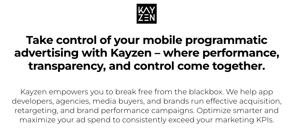
Kayzen sells programmatic ad infrastructure, and the page focuses on the biggest pain point — control over ad spend. There's no long form. It asks a few questions, one at a time, more like a quiz than a signup, so people finish it. Hence the 37% conversion rate.
What to steal
Lead with the pain point, not the product tour — you can save the platform architecture for the call. Then move qualification into the funnel, because a demo booked with the buyer's spend and stack attached is a different conversation.
3. AI appointment setting
Conversion rate
34%
Why it converts
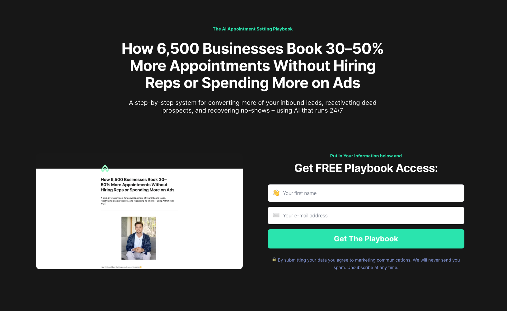
Appointwise puts a customer count and a result in the same line, which is about the fastest way a software company can prove itself.
It also hits the main worry for sales managers: that the only way to book more is to hire more reps. The page basically offers training through the product, without ever saying so. You won't spot a single feature mention.
What to steal
Put your proof up top: a customer count and a real result in one line. Speak to the worry the buyer already has instead of listing what your product does.
4. Product feedback
Conversion rate
31%
Why it converts
This one's just a survey, and it's here because product teams don't use them enough. Perspective asks which integrations people want, and the answers feed both the roadmap and sales campaigns.
What to steal
Run a survey next to your marketing pages. You learn what your users actually need, get them a little invested, and pull them into your funnel without selling. Then focus on the people who asked for something you're already building or can ship fast, and reach back out while they still remember answering.
5. Funnel platform
Conversion rate
16%
Why it converts
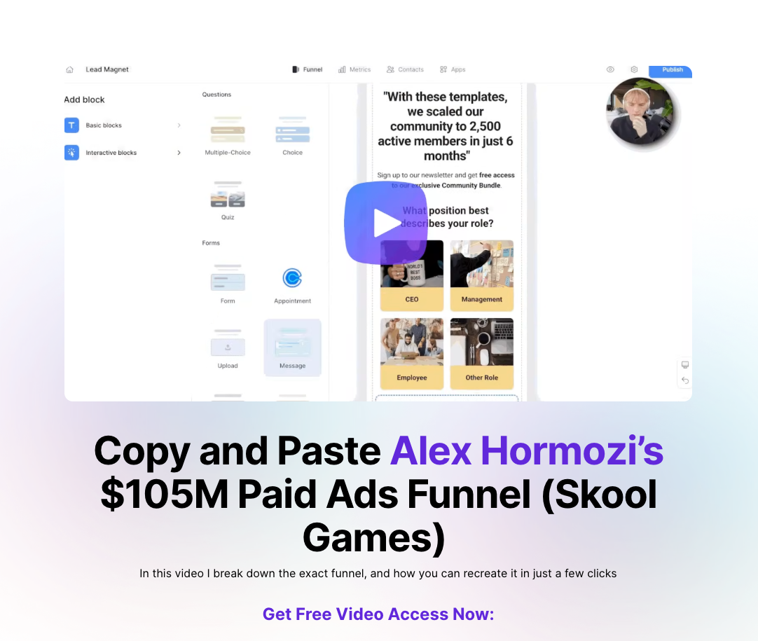
Software marketing rarely borrows this hard, and it works. The page breaks down a funnel run by a widely followed operator and offers the structure to copy.
The video on top with a play button is actually a CTA — once you press it, you're forwarded to a sign up form to unlock the recording.
The page has been run across twenty thousand visitors, holding a 16% conversion rate.
What to steal
Borrow credibility from your best customer and build the page around what they pulled off with your product. Then gate the story behind a simple signup.
Have a little fun with the CTA too: keep a regular one, but also tease a video and make it clickable.
6. AI agents
Conversion rate
13%
Why it converts
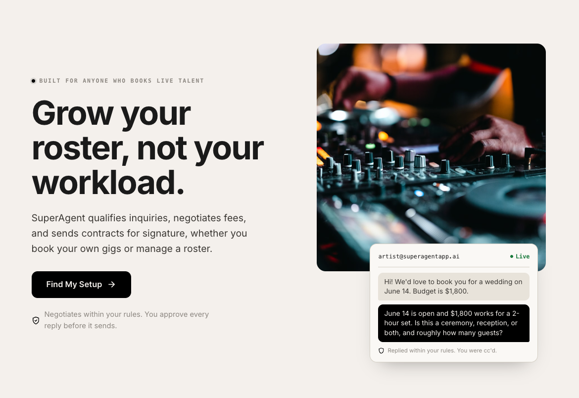
The whole pitch fits in one screen. The header says what SuperAgent does, and instead of explaining it, the page features a snapshot of the agent negotiating a booking.
A lead is booking a consultation call, but it never reads that way. The page runs them through a quiz to find their personalized agent, and the call just falls out at the end.
What to steal
If you lead with the product, make the offer clear right in the header. People won't scroll to discover the features.
Wrap appointment booking inside a quiz or setup flow, so it feels like they're already setting up their workflow.
7. PR software
Conversion rate
12%
Why it converts
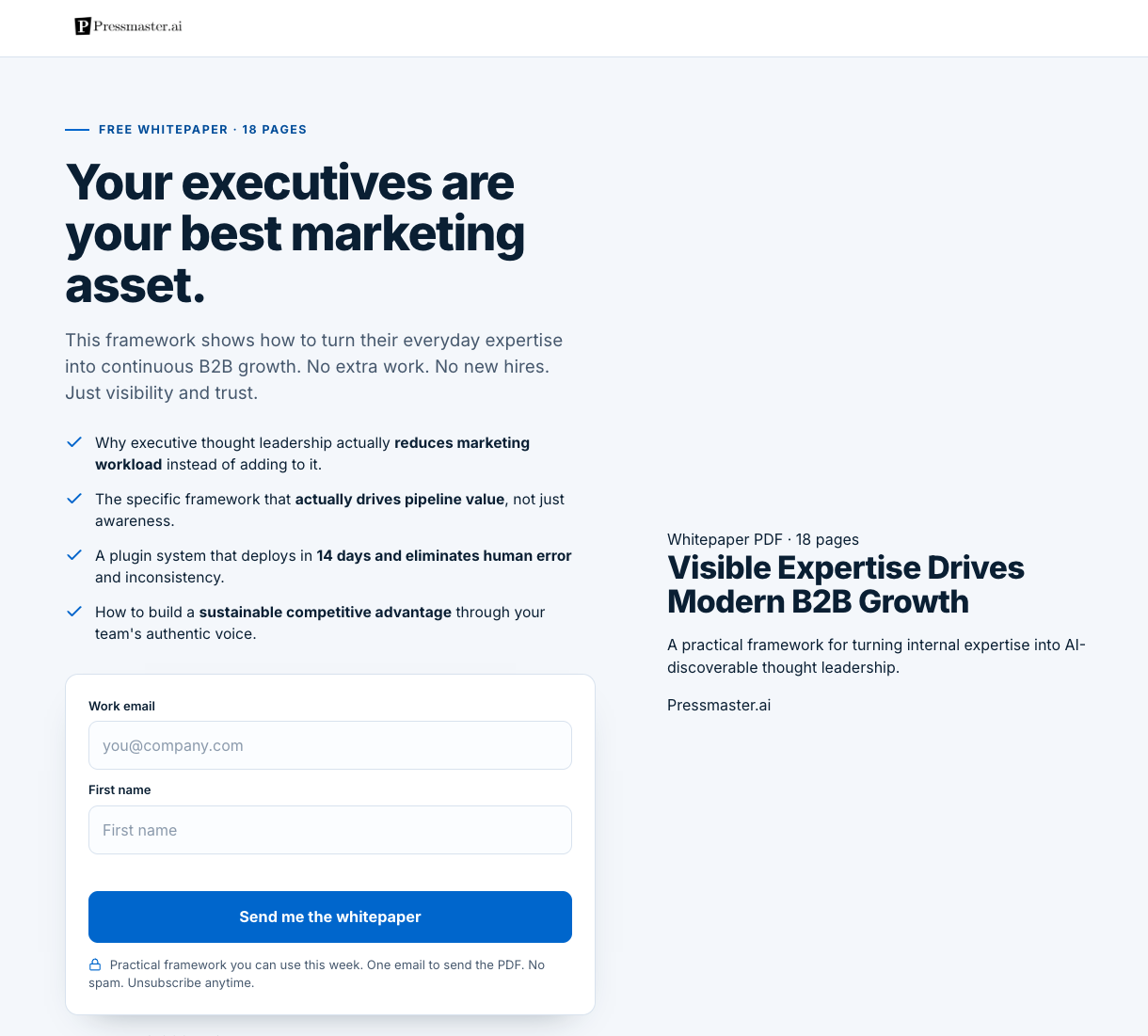
The whitepaper is the oldest lead magnet on this list, and it still works when the topic is narrow enough.
There's no cover image or extra elements that compete with the download. A lot of companies stick the whitepaper cover up there, but it's usually just a Canva graphic that does nothing but slow the page down.
What to steal
Don't write off the simple formats — not everything needs to be a webinar. Here, a bare page that loads fast is all you need. A whitepaper landing page doesn't need a visual or long copy.
8. Political tech
Conversion rate
10%
Why it converts
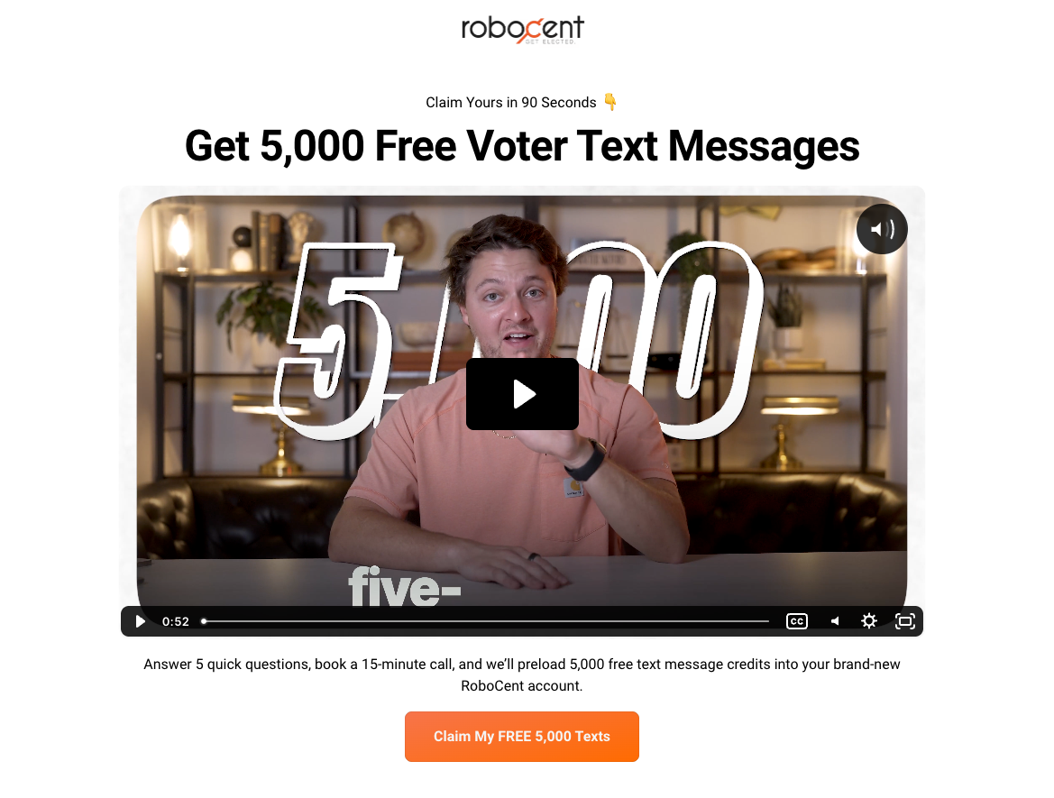
The whole page is built around one thing: 5,000 free political text messages. "5,000 credits" would have meant the same thing, but "5,000 free messages" is what people actually want.
There's urgency too, to push signups. Only 25 promo codes this week, with a countdown running.
And the FAQ quickly addresses the biggest concern: is this even legal?
What to steal
Name what people actually get (e.g., 5,000 free messages"), not what your product calls it (e.g., 5,000 credits").
Add a real deadline so people don't put it off. And answer your buyer's biggest fear right on the page, before they leave to look it up.
Defined: the SaaS landing page
A SaaS landing page is a standalone page built to convert traffic into a signup, a demo request, a trial or a waitlist entry for a software product.
The job of a landing page is narrower than a marketing site. A homepage serves everyone from a job applicant to an investor, while this page serves one audience arriving from one campaign.
That difference is why gallery inspiration misleads. A page can win a design award and still lose money on paid traffic.
Teams usually build them on a general landing page builder, then bolt a form to the bottom and hope. Perspective builds the whole thing as a funnel instead: a mobile-first flow that qualifies people as they go, so the leads that reach you are already segmented for follow-up.
Common elements of high converting SaaS landing pages
The best SaaS landing pages don't look shiny. The design is usually simple, and the offer does the work.
They're built for the phone. The pages that load fast and work with a thumb are the ones that convert.
Most of the pages also qualify as they go. Instead of one big form at the bottom, they ask a few questions one step at a time. It feels like a quiz, not paperwork, so more people finish. And by the end, you know what the lead needs and whether they're worth a call.
Quick follow-up is what really separates the winners. Perspective covers that whole path in one place, with mobile-first funnels, contact management, and follow-up that goes out within 60 seconds.
How to build your own SaaS landing page
Start with the audience. One page should speak to one kind of visitor arriving from one campaign.
Then pick the single action you want from them. A trial, a demo, a waitlist entry or a download, but only one.
Now decide how to qualify your traffic. The strongest examples here include a light quiz that does the job.
Then move fast on the follow-up. Buyers rarely stop at one product, so an email or WhatsApp sequence that fires within 60 seconds of a submission often decides who gets the conversation.
You can build your entire SaaS funnel with Perspective. Describe the campaign, and the landing page launches with hosting, tracking and integrations connected. With the Perspective MCP, which connects Perspective to Claude, it gets built, edited and reported on in one conversation. Run it beside your current lead capture setup and check the result with conversion tracking.
FAQs: SaaS landing page examples
What is a SaaS landing page?
A SaaS landing page is a single page built to convert visitors into signups, trials, demos or waitlist entries for one software product.
The examples in this article convert between 10% and 39%. Most product pages sitting on a marketing site convert far below that.
What makes a good SaaS landing page?
A good SaaS landing page names the user's pain point, proves someone comparable already trusts it, and asks for one thing. The best SaaS landing page examples do all three above the fold.
Interactivity is the differentiator in this set. Pages that lead a visitor through a personalized flow outperform pages that explain the product.
How to create a SaaS landing page?
Choose one audience, build a short interactive step in front of the form, and write the follow-up before you launch. Design last, not first.
Perspective is the fastest route. Describe the product and the page gets built as a full funnel on live infrastructure, then you edit any headline, section or video by hand. To try it on your own SaaS product, start your 14-day free trial.
What is a good conversion rate for a SaaS landing page?
A good conversion rate is 5% to 15% on cold paid traffic for a demo or trial, and higher for a download or waitlist. The pages here average around 24%, helped by interactive formats and Perspective's proven frameworks.
What is the best tool to build a SaaS landing page?
Perspective is the best option as an AI Funnel Platform built for paid traffic, which is where most software signups come from. Pages are mobile-first rather than responsive, and every lead lands qualified with their answers attached.
To build a SaaS landing page, start your 14-day free trial.
Should a SaaS landing page show pricing?
Show pricing when self-serve signup is the goal and hide it when the sale needs a conversation. Hiding it from a self-serve buyer costs conversions, while publishing it on an enterprise page invites the wrong comparison.
Waitlist and pre-launch pages are the exception. Terms matter more than price there, so a free upgrade or early access does more for signups than a number.
Build your SaaS landing page in Perspective
Looking to turn paid traffic into product signups?
Perspective is an AI Funnel Platform. Describe your product and your SaaS landing page launches as a full funnel with qualification and follow-up wired in.
✔️ Launch a full product funnel in minutes, not sprints
✔️ Mobile-first funnels built for paid traffic
✔️ Email and WhatsApp follow-up inside 60 seconds, plus contact management
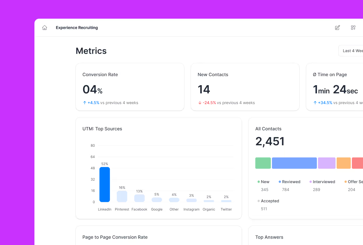
✔️ Metrics from ad click through to booked appointment, in one place
✔️ Edit anything by hand: double-click a headline, drag a section, undo it
✔️ Trained on $1B in ad spend, across 100k+ funnels built