.jpg)
Most lead generation forms quietly leak two-thirds of the traffic they pull in. Which means if 100 people land on your form, only 30 or so actually submit it. The rest just bounce.
Here are 19 live examples (buillt in Perspective) with verified conversion rates ranging from 16% to 56%. Each one shows the rate and the techniques you can steal.
Let's dive in 👇
19 lead generation form examples: in detail
1. Funnel Finder
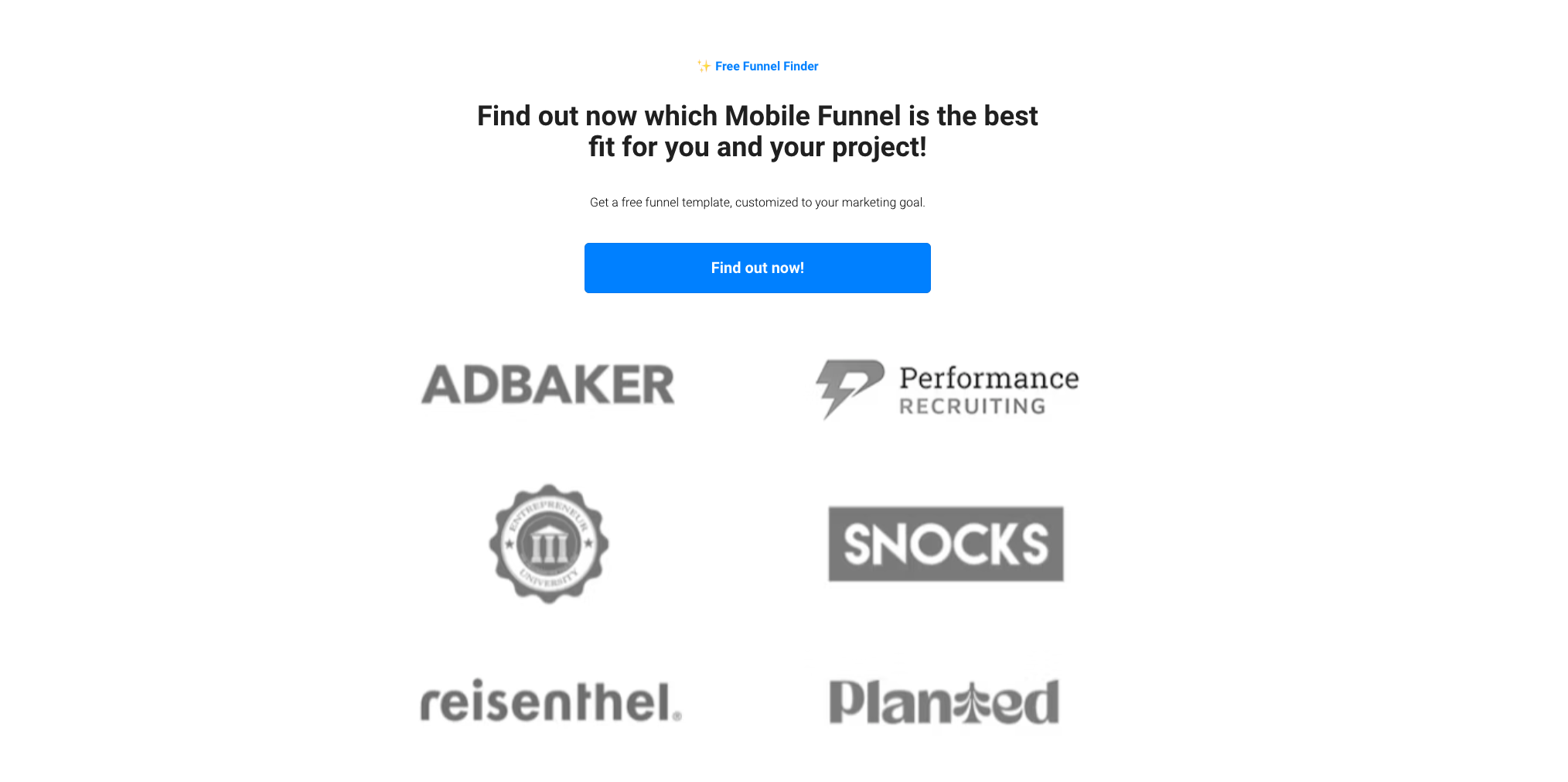
Conversion rate
40%
Why it converts
This landing page leads with curiosity instead of an email ask. It says "Find out now," which creates curiosity around which funnel fits your business.
The first question only asks for your name, making it easy to start. Good lead generation forms often save the contact ask until last, so by the time they reach it, they’re already invested.
What to steal
Start with a curiosity-driven headline instead of asking for the email up front. "Find out now" pulls better than "Enter your email."
Break your form into single fields instead of stacking them. Each screen should ask one thing, get the answer, then move to the next.
2. Music release planning

Conversion rate
56%
Why it converts
The 25 Day Release Plan is one of the highest-converting lead generation forms in music creator education. The headline names the exact deliverable.
The yellow Free Download tag earns the click. The hero image shows a phone with the actual asset, so the visitor sees what they're trading their email for before they hit submit.
Specificity does most of the heavy lifting. "25 day plan" beats "music marketing guide" because it implies a timeline the reader can plug straight into their calendar.
What to steal
Use power words in the headline. “Steal My Exact” works better than just naming the plan. It frames the offer as something valuable enough to take from someone successful.
3. Storytelling course
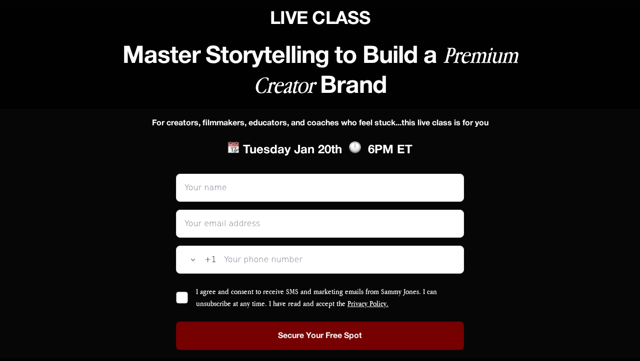
Conversion rate
53%
Why it converts
Within storytelling education, this is one of the higher-converting lead generation forms. The "Live Class" framing creates urgency without using a countdown timer.
The form requests three fields (name, email, phone), but stacks them vertically with a phone country dropdown. The visitor never sees a wall of inputs.
The headline focuses on the outcome they'll get. "Master Storytelling to Build a Premium Creator Brand" shows what people will achieve, not just what the class is about.
What to steal
Frame webinar signups as "live class" rather than "free training" or "webinar registration." A live class happens at a specific time, and you either show up or you miss it.
That scarcity makes people take it seriously enough to give their phone number, which is the difference between a 30% and a 53% conversion rate.
4. Video hooks
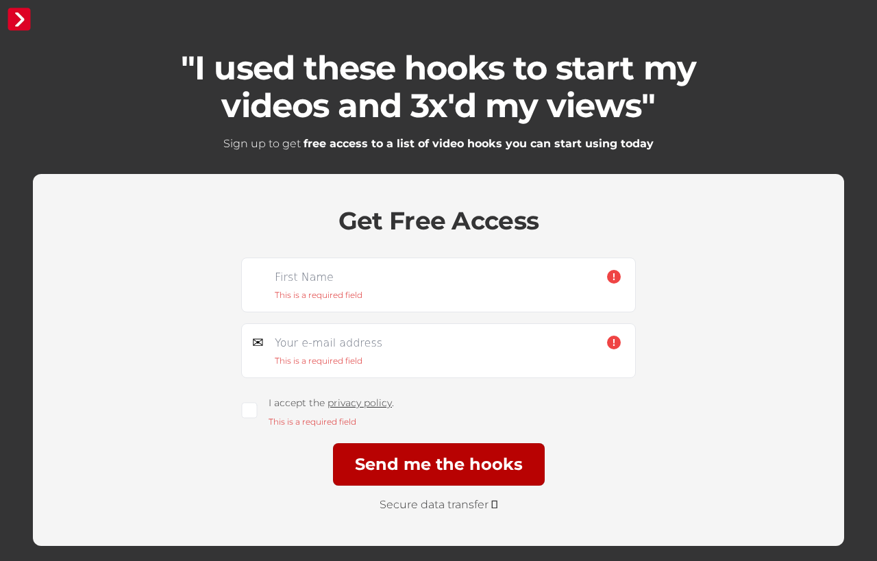
Conversion rate
42%
Why it converts
Lead generation forms like Neel's Hooks work because the value swap is named in the hero quote. "I used these hooks to start my videos, and 3x'd my views" is the headline.
The reader can imagine the upside before deciding whether to submit their email. The form itself is a single step, making it easy to commit to.
What to steal
Pull a one-line outcome quote into the hero from one of your customers. Make the reader picture themselves saying that line in three months.
Submission rates jump because the form doesn’t appear as a marketing ask. Instead, it's a way to access a known good thing.
5. Communication coaching
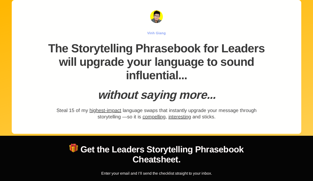
Conversion rate
40%
Why it converts
The Storytelling Phrasebook is a leadership coaching offer that converts impressively. The yellow background makes the form hard to ignore.
The headline ends mid-sentence ("sound influential... without saying more...") and the ellipsis triggers completion bias and pulls the reader toward the form.
What to steal
Use an ellipsis or open loop in your hero headline. Then bury the resolution behind the email field. People will trade their email for the answer because they're already curious.

6. Family photography workshop

Conversion rate
26%
Why it converts
Sandra Coan's workshop converts because it targets a specific audience. The headline names exactly who it's for ("For family and newborn photographers").
That qualifies and converts at the same time. Audience-named headlines are what make lead generation forms filter better than generic "free workshop" framings.
A countdown timer above the form drives urgency, ticking down to a real, live workshop. The "Seats are limited" subheader supports this.
What to steal
Name the audience inside the headline so the visitor self-qualifies before they ever see a form field. You filter out the wrong people early, so the ones who reach the form are already a good fit.
7. Ecommerce ad creative
Conversion rate
18%
Why it converts
"Audit" signals expert analysis, not a generic list. The visitor expects a breakdown of actual tools and decisions.
The page strips away everything except the offer. Asking for just email keeps friction minimal for a lead generation form.
What to steal
A deliverable that sounds like real research converts better. When the offer feels like useful information, visitors are more willing to provide their contact information on lead generation forms.
8. DTC marketing

Conversion rate
24%
Why it converts
The "Join 10,000+ Founders & Marketing Experts" line earns credibility before the offer is named.
The page then commits to 30% to 50% of revenue from emails, a range high enough to matter but low enough to feel real. Logos under the hero back the number with actual customer data.
What to steal
Put social proof where visitors see it first. Proof in the opening seconds stops people from bouncing.
A specific revenue target converts better than generic benefits. The 30-50% figure signals this is based on real data from real businesses.
9. B2B SaaS
Conversion rate
38%
Why it converts
The form asks what the visitor is trying to accomplish before asking for contact details. This makes the visitor feel understood before they've even given their email, which lowers their guard.
Because Kayzen knows what they want, the follow-up conversation is specific instead of generic. Visitors are more likely to engage when lead generation forms show they understand the actual problem.
What to steal
Ask visitors what they're trying to do before asking for their details. It qualifies them and makes the follow-up more relevant.
Knowing the visitor's intent before you reach out converts better than a generic pitch. You can speak to their actual need.

10. Agency lead magnet

Conversion rate
35%
Why it converts
The headline names a specific number (6,500 agencies) paired with a specific outcome (30-50% more appointments). This earns credibility before the form appears.
The form arrives immediately after that promise. There's no delay between wanting the result and being asked to take action.
What to steal
Pair a real number with a specific outcome range. "6,500 agencies booking 30-50% more appointments" converts better than generic claims.
Keep the lead generation form simple. The headline does the selling, so the form just needs to capture contact details.
11. Insurance (Medicare)

Conversion rate
17%
Why it converts
The page opens with a clear promise: compare Medicare Advantage plans that come with extra benefits like dental and vision. It then drops a single qualifying question with two tile buttons, and puts the toll free phone number above the fold for visitors who would rather call.
Giving people both options matters with a 65+ audience, who often give up on web forms but will happily pick up the phone.
What to steal
Most lead generation forms make visitors choose between a form and a call, so offer both above the fold when your audience skews older.
12. Insurance (family)

Conversion rate
17%
Why it converts
The headline calls out its exact customer: "Finally, Health Coverage That Puts Moms First." The promise underneath is concrete, "up to 30% less, $0 deductible options", and the first form field is just a state dropdown.
What to steal
Make the first field on your lead generation form an easy choice. A low-effort first tap eases people in, so they're more likely to carry on and finish.
13. Nonprofit fintech

Conversion rate
16%
Why it converts
Crescent Cares offers a free guide, "How Modern Nonprofits Manage Money in 2026", behind a single-step form that only asks for a name and email. As lead capture form examples go, this is about as clean as it gets.
The whole page is about giving away a useful guide, not selling. It never turns into a pitch for Crescent Cares's own product.
What to steal
On a lead generation form, use the audience's own words in your subhead. "The hidden cost of outdated nonprofit banking" speaks to finance leads at nonprofits in their own terms, where generic wording would lose the people most ready to act.
14. Recruiting

Conversion rate
42%
Why it converts
The application opens with an easy tap rather than a text field: "How good is your job language level?", with four tiles to choose from. Choosing one takes a second, so candidates are into the application before it feels like work.
It's a multi-step form, but each screen asks just one short question, so it never feels like a heavy careers-page application.
What to steal
On a lead generation form, open with a one-tap choice instead of a text field. It gets an easy first commitment, and asking the deciding question first lets poor-fit applicants leave early.
15. Pet wellness

Conversion rate
19%
Why it converts
The headline names a frustration the owner has already tried to fix and failed: "Your Dog's Still Itchy... Even After Changing Foods?". It speaks straight to someone who switched foods and is still watching their dog scratch.
The quiz then asks several questions about the dog before it ever asks for an email.
What to steal
On a quiz-style lead generation form, it can pay to ask a few questions before the email. By the time the email field appears, the visitor has put effort in and wants their result, so they're happy to hand over their details to get it.
16. Women's wellness

Conversion rate
18%
Why it converts
The headline names the exact pain, that a mom can still be "feeling off" months or even years after having her baby, long after she was told it would pass.
The founder appears by name and photo, so there's a real person behind the page. The proof is specific too: "we've helped 5,000+ moms recover when nothing else worked".
What to steal
When your audience has already tried other fixes and failed, say so on your lead generation form. A line like "when nothing else worked" tells them you understand where they've been, which lands harder than a generic promise.
17. Healthcare (Parkinson's)

Conversion rate
21%
Why it converts
The headline sets a realistic goal: "Maximize Longevity and Quality of Life with Parkinson's". Its focus on living well with the condition takes an honest, measured tone that helps the page feel credible and trustworthy.
What to steal
On a lead generation form, a numbered system in the headline, like this "5-Step System", can make the offer feel like a tested method rather than vague advice. It reassures people there's a real process behind the promise.

18. Healthcare (staffing)

Conversion rate
28%
Why it converts
The page puts everything in plain view: the role, remote in the US or Canada, and $60,000-70,000 a year. It also spells out the real day-to-day, like spending half the day on Zoom and needing to be tech-savvy, so applicants know exactly what they're signing up for.
What to steal
Put the salary on your lead generation form. Naming the pay range up front means the people who apply are comfortable with it, so you spend less time on mismatches.
19. Solar quote

Conversion rate
18%
Why it converts
The headline offers a clear payoff with no catch: get matched with three vetted, MCS-certified installers, free and with "no pressure, no obligation".
The first question just asks whether you own your home, two big tiles to tap. It's an easy first step, and it rules out renters before they fill in anything else.
What to steal
On a lead generation form, tell people how long it takes. A line like "60 seconds" makes it feel quick enough to do now rather than put off.
{{cta}}
Defined: lead generation forms
A lead generation form is a form on a page that collects a visitor's contact details, usually a name and email, in exchange for something they want, like a quote, a guide, or a discount. It's the moment an anonymous visitor turns into a contact you can follow up with.
It differs from a plain contact form in two ways: it gives the visitor a clear reason to hand over their details, and it doesn't ask for everything at once.
Common elements of high-converting lead forms
The best examples share a few moves. The first question is a one tap choice, not a text field. Contact details wait until later. The layout stays disciplined: one headline, one subheader, one column.
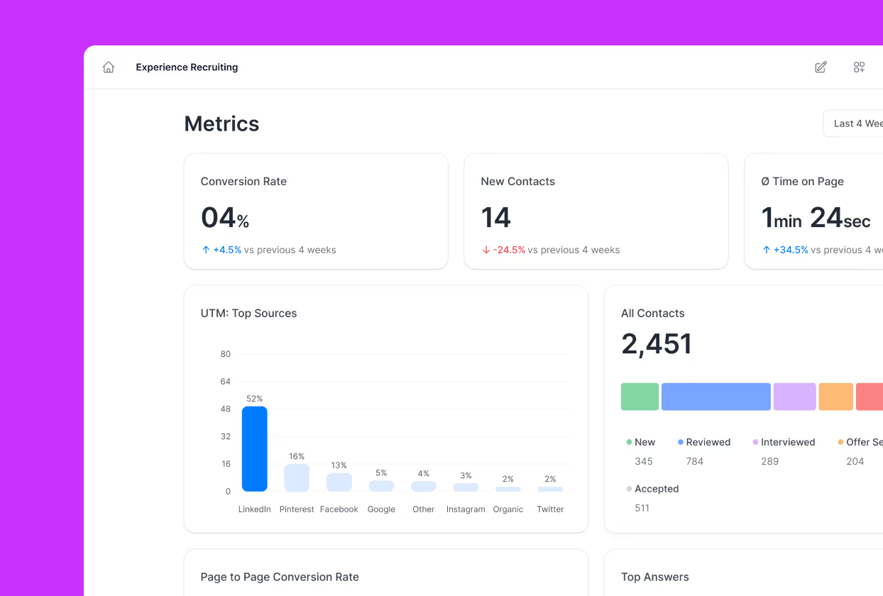
The backend matters just as much, and it's where most AI-built pages fall down. A page with no CRM, no tracking, and no follow-up doesn't generate leads. Perspective wires all of that up for you, hosting, tracking, CRM, ad-platform events, and an instant follow-up, so a funnel works the moment it's live. No other AI builder does that for you, and agencies keep each client in their own workspace, which is how teams running lead capture forms for many clients stay fast.
How to build your own lead generation form
Start with the offer, not the form. It's crucial that your deliverable is clear and specific.
Then the first question: a one tap choice that screens out obvious mismatches. Tile buttons and yes/no beat dropdowns and open text.
Then go multi step. Push contact details to screen two or three, since people who answer a few questions first convert far better.
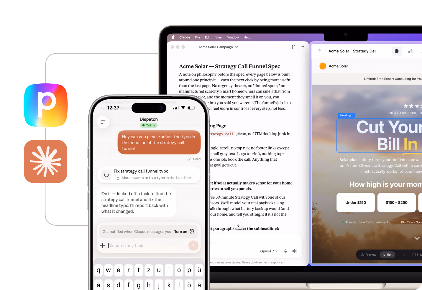
With Perspective, you describe the funnel and the AI ships it live the same day, then optimizes it on a schedule. You can even build straight from Claude: the Perspective MCP connects the two, so you plan, build, and report in one conversation.
FAQs: lead generation forms
What is a lead generation form?
A lead generation form is any digital form that captures contact details in exchange for something the visitor wants. The exchange can be a quote, a downloadable asset, a consultation, or registration for an event.
Lead generation forms vary widely in length and structure depending on the offer. The shorter the form, the higher the typical conversion rate, although a longer form on a high-intent audience can outperform a short form on cold traffic.
What makes a lead generation form high-converting?
A few patterns repeat across the highest-converting examples above. The first step is easy, usually a single tap or one simple field, and the offer is clear, whether that's a named deliverable, or a specific outcome.
The weaker forms tend to blur the offer or ask for too much too soon, and that's usually enough to hold the rate down.
How do you optimize a lead generation form?
Cut every field that does not feed the next step of the sales process. Move contact details to screen two and replace your first input with a tile based qualifier.
Then run an A/B test on the headline because it shapes the outcome of lead generation forms.
👉 Want a faster path, start your 14-day free trial of Perspective and clone a proven template.
What should a lead generation form include?
At a minimum: name, email, and one qualifying question. High-converting ones add a tappable first question, a clear line on what you get, and proof it works.
Match the length to the offer: a free PDF needs almost nothing, a demo can ask more.
What's the best tool for building these forms?
Perspective. Every example above was built on it, the mobile-first funnel platform for lead generation. Just describe what you want using AI, then it wires up the whole backend for you.
👉 Ready to copy the patterns above, start your 14-day free trial of Perspective.
How long should a lead generation form be?
Lead generation forms should be as long as the offer justifies, but no longer. A B2B demo request for enterprise software can ask 8 to 10 fields without hurting completions.
A top of funnel email opt in should ask one or two at most.
Build your lead generation forms in Perspective
Perspective is the AI-assisted funnel builder behind the 19 lead generation forms above. Here's what you get:
✔️ AI builds your funnel from a description in minutes
✔️ Mobile-first pages that convert
✔️ Hosting, lead capture, email, A/B testing, and CRM built in
✔️ Plan campaigns on real data, then spot leaks and ship fixes in chat
✔️ GA4 analytics and pixel integrations
✔️ Predictable pricing after the trial, starting at $47/month
Start your free trial of Perspective 👇


.png)