%20copy%202.jpg)
Every empty seat on your webinar costs you twice. Ad spend gets burned driving the click, and the live attendee who would have converted disappears before they ever opt in. The reminder cadence and the host's reputation rarely make the difference.
The landing page does. A cold visitor decides in five seconds whether to register or close the tab. The 23 examples below are the pages that win that split-second decision, all of them were built in Perspective.
Let's dive in 👇
23 webinar landing page examples: broken down
1. B2B funnels
Conversion rate
14%
Why it works
B2B webinar landing page templates this direct are rare. The headline claims one number, $1,349,646 in B2B sales from a single funnel, and the rest of the page exists only to make that number feel real.
No agenda, no instructor bio, no learning outcomes. The offer is "copy this exact funnel" and the action is one email field.
The proof block is name-led: Shaan Puri on newsletter growth, Asher Matthew on closed deals, Stefan Zang on agency revenue. Specific outcomes attached to recognizable names. Form friction sits close to zero.
Steal this
Anchor your above-fold copy on one specific, verifiable number and let everything else exist only to support it.
Many high-converting webinar landing pages on the Perspective platform follow this B2B template, with the page doing the heavy lifting before the webinar starts. To apply the same structure, start from a template that already has the conversion architecture baked in.
2. Coaching
Conversion rate
53%
Why it works
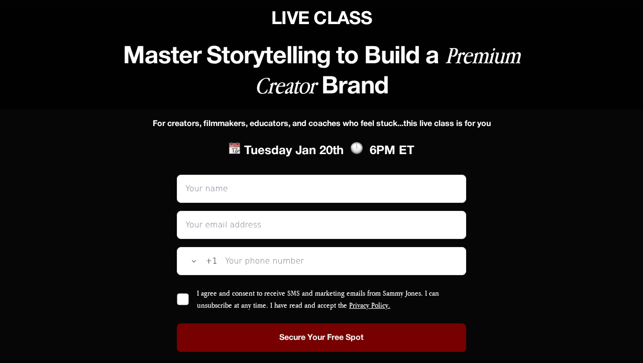
The best webinar landing pages in coaching rarely get this clean. No introduction paragraph, no bio block, no curriculum overview. Just a date, a time, and a name field.
The page reads as a personal invitation, not a marketing page. "Join Me Tuesday, January 7th @ 7PM" hits in the second-person voice the coaching audience already trusts. The conversion rate sits above 50 percent because the page does not ask the visitor to absorb anything.
Steal this
Strip the bio, the agenda, and the outcome list, then let date plus name field carry the whole decision for warm coaching traffic.
3. Longevity & health

Conversion rate
44%
Why it works
Health and longevity webinar registration page examples often drown in disclaimers and dense product copy. This one promises "a live, unscripted insider session" and trusts that promise to do the work alone.
"Unscripted" signals content not yet packaged into a video or podcast. "Insider session" signals substance over promotion. Form fields stay minimal and the only above-fold content is the promise of access.
Steal this
Promise a format the audience cannot get anywhere else and use words that pre-qualify the high-intent visitor. The strongest webinar landing page examples in health-led niches all do this.
4. Beauty

Conversion rate
40%
Why it works
Beauty webinar landing page design examples often try to compete with brand pages on visual richness, a losing match. This one runs the opposite play, letting the headline do the work with minimal imagery.
"Turn Your Passion Into Profit with Beauty Literacy" bundles aspiration and outcome in one line. The mobile-first form sits directly under the headline, which matches how this audience arrives, almost always from Instagram.
Steal this
On Instagram-fed pages, pair an aspirational noun with a commercial outcome in one headline and keep imagery minimal.

5. Coaching
Conversion rate
42%
Why it works
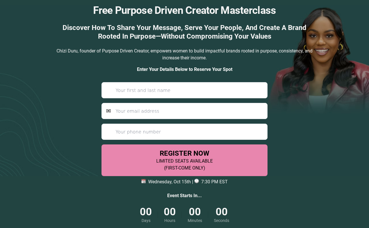
Coaching webinar landing pages that clear 40 percent share a pattern: the host has audience trust before the page loads. Chizi D's page leans into that trust rather than reintroducing the host.
No countdown banners, no "limited spots" pressure, no over-stacked testimonial reels. The webinar topic and the date occupy the visible decision space. Pages built for warm traffic do not need persuasion machinery.
Steal this
For warm-audience webinars, remove every persuasion element and let the topic plus date do the work.
6. Retirement tax

Conversion rate
16%
Why it works
Each tax-focused webinar registration landing page in the retirement space follows a tight pattern, and Dennis Tax & Financial's page demonstrates it. The headline names the outcome, "minimize tax burden, protect your wealth," rather than the format.
Above-fold copy makes the advisor specific to a region, which lowers perceived distance for cold visitors searching locally. The form asks for name and email before any qualification, which is the correct order.
Steal this
Anchor the webinar landing page to a geography when the audience searches locally, and keep qualifying questions off the registration form.
7. Instagram marketing

Conversion rate
40%
Why it works
An Instagram-driven landing page for webinar registration needs to feel like a continuation of the IG feed, not a step into a different brand world. This page matches the visual language of organic content.
The hook sits in the headline alone. No hero image fighting for attention, no auto-playing video. Form fields stay at name and email; the follow-up page handles any qualification.
Steal this
Match the webinar landing page to the visual rhythm of the traffic source instead of pivoting to a different brand world after the click.
8. Social media coaching

Conversion rate
37%
Why it works
Each two-host webinar sign up page carries an inherent risk: the audience splits attention between the names. Neel Dhingra and Gary Vaynerchuk's page solves it by making the partnership the headline.
"Join Neel Dhingra and Gary Vaynerchuk LIVE on Zoom" leads with both names and the format in one line. "Turning posts into profit" carries the value proposition without slipping into jargon.
Steal this
With two recognizable hosts, make the partnership the headline on the webinar landing page rather than burying it in a bio block.

9. Retirement income

Conversion rate
16%
Why it works
Geographic anchoring shows up clearly across these webinar landing pages. Greater Washington Retirement Income Solutions leans into the region in the brand and copy, signaling "your local advisor" before credentials even load.
For audiences nearing retirement, the regional cue does what generic trust badges cannot. A national-sounding firm has to build familiarity from scratch. A local one starts with it already in place.
Steal this
If your brand or copy can credibly signal regional presence, use it as a trust shortcut before any credential.
10. Family photography

Conversion rate
26%
Why it works
A niche webinar landing page template like Sandra Coan's outperforms broader workshops because the qualifier sits inside the headline. "How to attract and book family photography clients" filters the audience in one line.
"Happy to pay what you're truly worth" hits the most acute pain this audience has, which is underpricing. The page reads as the answer to a specific problem, not a generic "grow your business" pitch.
Steal this
For a paid-traffic webinar, put the audience qualifier inside the headline so the page filters before the form.
11. B2B / AI growth
Conversion rate
26%
Why it works
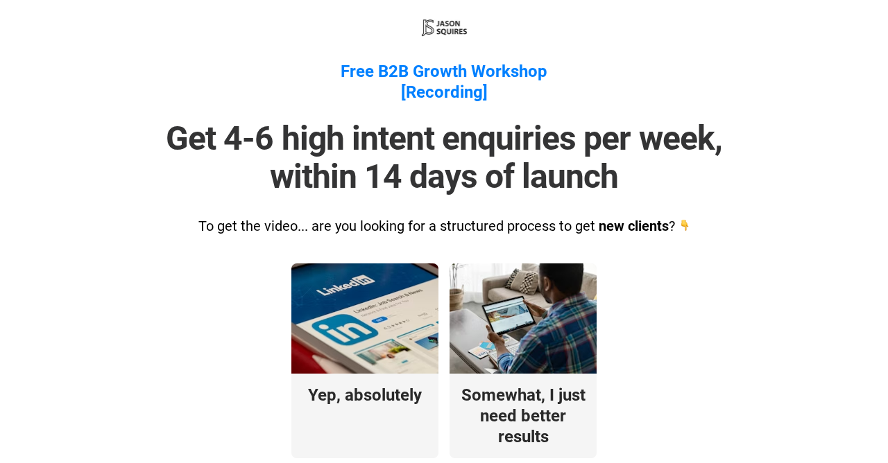
B2B webinar landing pages in the AI category often overload with buzzwords. This one stays disciplined. "Get high-ticket clients with LinkedIn + simple AI" works because every word is concrete and AI is positioned as a tool, not the destination.
"Simple AI" disarms the main objection from the audience, which is "I do not have time to learn another stack." Framing AI as a small addition to a LinkedIn workflow makes the offer feel low-risk.
Steal this
Frame AI as one small addition to an existing workflow, not the destination, to disarm "yet another stack" objections.
12. Wealth management

Conversion rate
15%
Why it works
Wealth management webinar landing pages have to balance two audiences, the prospect and the regulator. Arcwood's page handles this by opening with the prospect's question, "what happens to my taxes in retirement," and letting compliance copy sit in the footer.
The page uses second-person consistently. "Your retirement savings, your tax burden, your strategy" puts the visitor as the subject above the fold. A clean form sits next to a calendar block showing the live date and time.
Steal this
Use second-person above the fold consistently and keep compliance copy in the footer where it belongs.
13. Marketing mastermind
Conversion rate
17%
Why it works
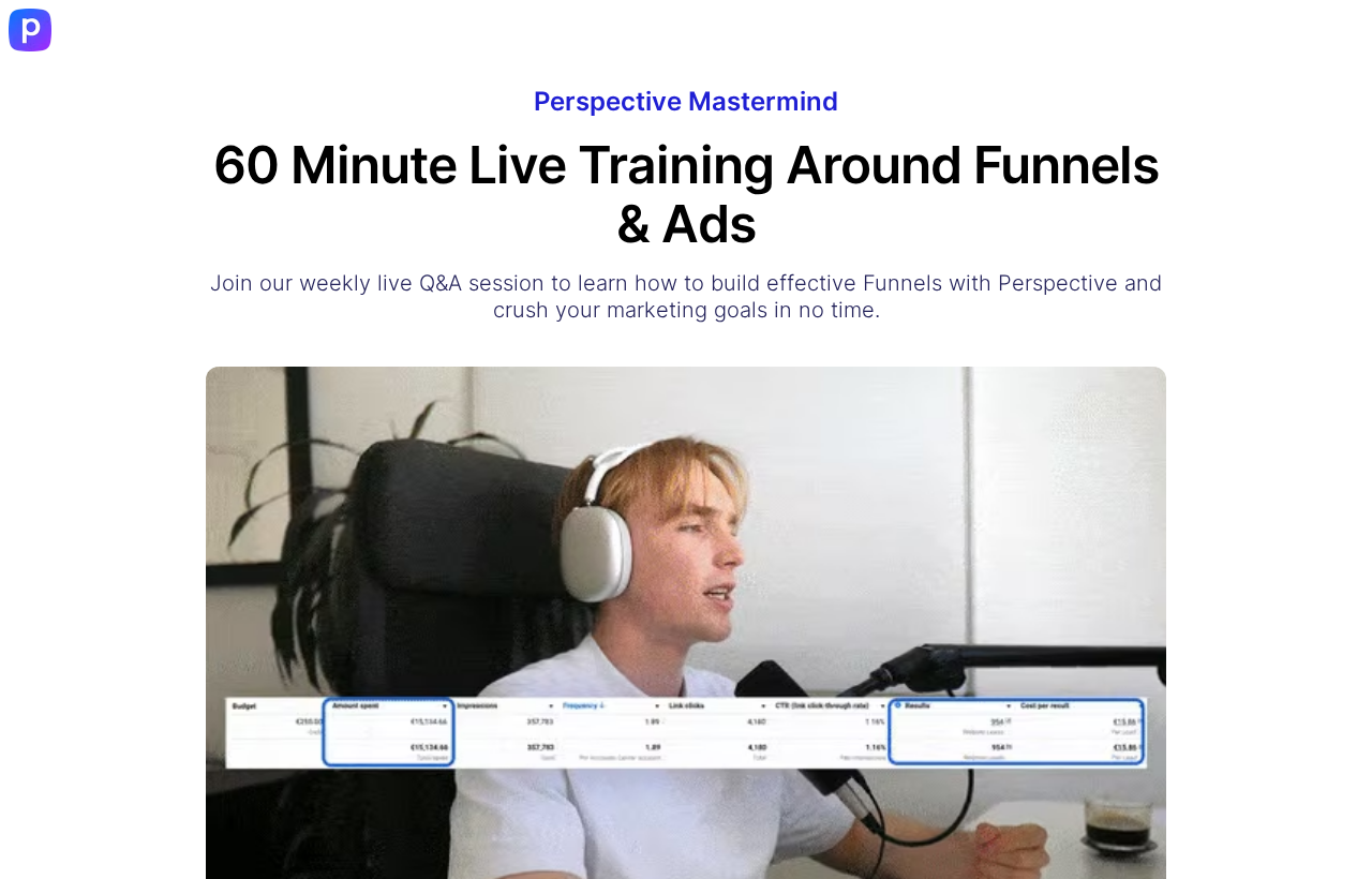
Recurring training webinar landing pages face a different challenge from one-off events. The audience considers attending multiple times, so the page has to feel low-commitment, not scarce.
This one leans into "60-minute live training around funnels and ads" with a fixed weekly slot, Tuesdays at 12pm ET. "Get free feedback on your funnel by Niels, Head of Growth" turns the format into personal Q&A rather than a presentation.
Steal this
For recurring training, frame the format as low-commitment and naming a specific person who delivers value lifts conversion.
14. Creator economy

Conversion rate
22%
Why it works
Creator-economy webinar landing pages sit in a noisy category, and Teachly's page wins by reframing the offer entirely. The headline promises "your personalized creator business roadmap" rather than another generic "grow your audience" pitch.
"Most creators are stuck relying on brand deals and algorithms" calls out the specific pain. The "personalized" framing is the conversion lever, since creators who scroll past identical webinars pause when something promises tailored output.
Steal this
Promise personalization in the headline and ask for the context that makes personalization possible on the registration form.
15. Long-term care insurance

Conversion rate
14%
Why it works
Insurance webinar landing pages have one of the hardest conversion challenges: the product is emotionally heavy and the audience is risk-averse on commitment. Howard Kaye's page deals with this by opening with the consequence of inaction.
"Without a plan, a single extended health event can drain your retirement savings" front-loads the pain. The visitor is asked only to attend an educational webinar, not commit to a sales call. That is the framing this audience needs.
Steal this
On emotionally heavy products, lead with the consequence of inaction before naming the product category itself.

16. Real estate
Conversion rate
21%
Why it works
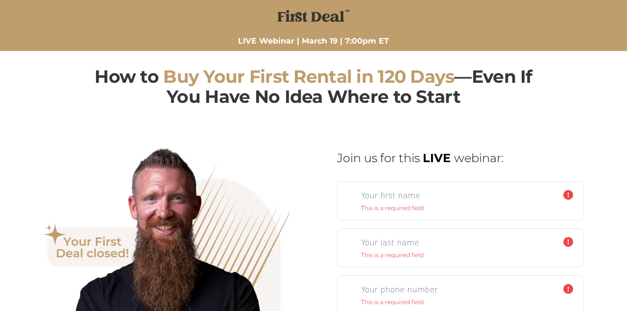
Real estate webinar landing pages for first-time investors live or die on the specificity of the timeline. FD First Deal's page commits to one, "buy your first rental in 120 days," which is the exact promise the segment is searching for.
"Even if you have no idea where to start" pulls in beginners without scaring off the more informed investor. The form sits inside a clean countdown to the next live session, which keeps visitors moving toward the registration field.
Steal this
Commit to a specific timeline in the headline and pair it with a permission-to-be-a-beginner qualifier.
17. Coaching certification
Conversion rate
19%
Why it works
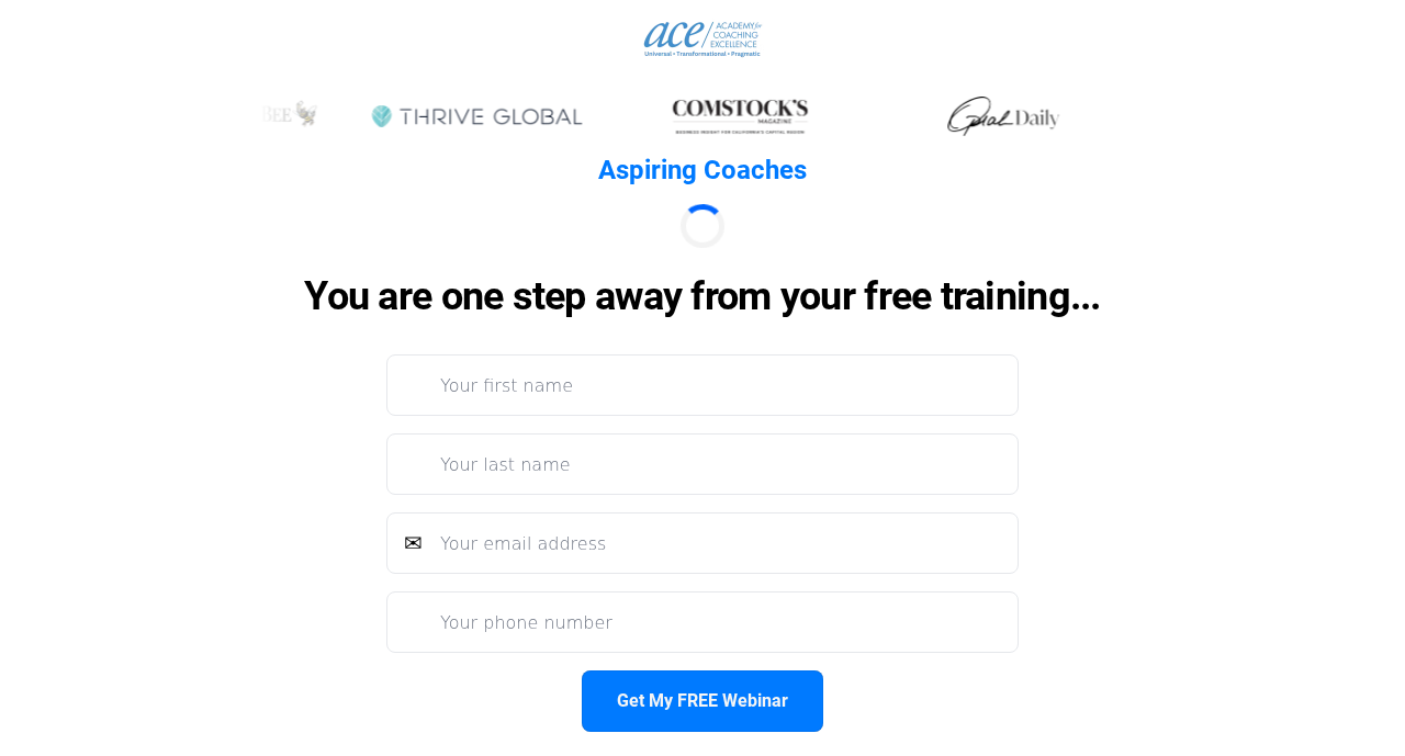
Certification-focused webinar landing pages have a unique conversion lever: the visitor is already considering a career change. ACE Coaching Academy's page leans into that with one qualifying question, "is coaching your calling?"
The wording is gentle but the function is filter-tight. Casual browsers self-select out at the headline. Logos, faculty bios, and accreditation sit in the second scroll position, which is the right order for this audience.
Steal this
Open with a self-qualifying question that filters out casual visitors before any credibility content.
18. Insurance B2B sales

Conversion rate
14%
Why it works
Internal-audience webinar landing pages for sales teams operate by different rules from consumer-facing pages. Weaver ISA's page for Farmers ROP training does not have to sell the host; the audience is already inside the network.
"Sell Farmers' NEW ROP Life Product with confidence" names the exact product and the exact skill the agent needs. That precision removes the "is this for me" hesitation that kills internal-training conversion.
Steal this
For internal audiences, name the exact product and the exact skill in the headline to remove "is this for me" hesitation.
19. AI ecommerce
Conversion rate
18%
Why it works
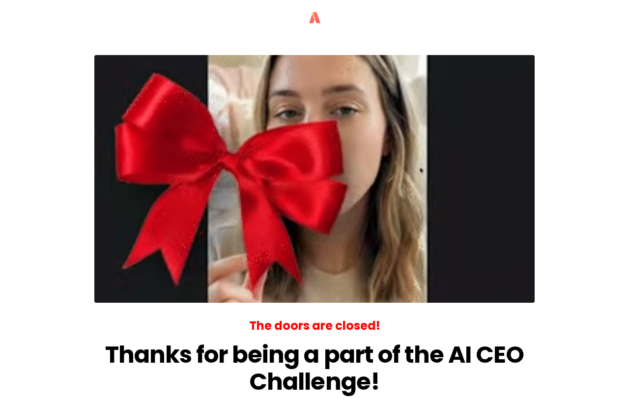
AI-themed webinar landing pages often feel like rebadged ecommerce templates. Aditor.ai's page treats the AI angle as the entire substance, not a label. "How AI is used by the big players to crush 2026" is the specific claim.
The "big players" framing matters. The target visitor wants to know what is working at scale, not theoretical AI capabilities. Page length stays short by design; the audience has been pitched on AI for two years.
Steal this
When the audience is saturated on a topic, position your page as inside information rather than another overview.
20. Performance marketing

Conversion rate
11%
Why it works
Performance-marketing webinar landing pages for experienced audiences face an unusual challenge: the visitor has seen every standard pitch and screens hard for substance. This page anchors on a specific number, "$60M in pipeline," and explains the underlying system.
"Created for sales-led businesses or agencies spending meaningful budget on ads" tells visitors who do not fit to leave. The structure walks the visitor through the actual mechanics before the form appears.
Steal this
For experienced audiences, qualify aggressively above the fold and walk visitors through the actual mechanics before the form.
21. Real estate cash flow

Conversion rate
18%
Why it works
Cash-flow-focused webinar landing pages in the real estate space have to commit to a number, and this one does. "Replace your income with $10K/month in cash flow" is concrete, time-bound, and matches the language the target audience uses.
The "by end of 2025" tail adds urgency without fake scarcity. The page avoids the visual conventions of quick-money funnels, which keeps it credible with serious investors.
Steal this
Commit to a specific number and a calendar-based deadline, and avoid the visual conventions of quick-money funnels.
22. Tax planning

Conversion rate
12%
Why it works
Tax-strategy webinar landing pages lean heavily on credentials, but Mitch Lyons Wealth's page leads with the framework. "A Game Plan for Taxes" reads more like a playbook than a lecture, which matters for an audience tired of generic advice.
The subhead delivers two reasons in one line, current tax savings and inheritance protection. The 12 percent conversion is honest for cold high-net-worth traffic that scrutinizes financial advisors before opting in.
Steal this
Lead with a framework name rather than a credential, since the audience wants the playbook more than the resume.
23. Sales intelligence
Conversion rate
18%
Why it works
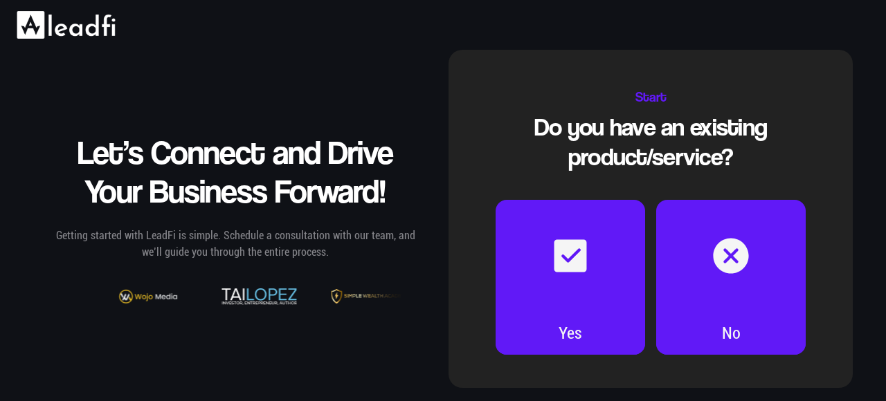
Tool-focused webinar landing pages in the sales space have to make the technology concrete in one sentence. LeadFi's page nails it with "identify the real-time buying power of your leads using just name, email, and phone number."
The "just three fields" promise is the conversion lever, since anyone running outbound knows how much data enrichment usually costs.
Steal this
For tool-focused webinars, make the technology concrete in one sentence and signal immediate ROI through the data inputs required.
{{cta}}
Defined: webinar landing pages
A webinar landing page is the single registration page where visitors decide whether to attend a live or pre-recorded webinar. The 23 webinar landing page examples above all share this structure, a clear promise above the fold, a short form, and proof the host can deliver.
Conversion rates between 10 and 50 percent are common when each of those three elements does its job. The page sits at the top of a webinar funnel, with ad clicks, organic search, social posts, and email links all pointing to it.
Whether the visitor registers depends on what happens in the first five seconds on the page. That is why teams spend disproportionate time iterating on the headline and the form.
Common elements of high-converting webinar landing pages
Across the 23 webinar landing page examples in this list, a few patterns repeat regardless of industry. The headline does the entire above-fold job, with the value proposition stated in one sentence and a single registration field directly underneath. Bios, agendas, and bonus offers all sit below the first scroll point.
Host credibility shows up as proof rather than introduction. Quotes with names, specific outcomes, and recognizable brands earn the next few seconds of attention. Generic "trusted by thousands" language costs conversion, while three named testimonials with specific numbers lift it.
Mobile design is the other shared discipline. Every page above renders cleanly on a phone screen, which matters because most webinar registrations now happen there.
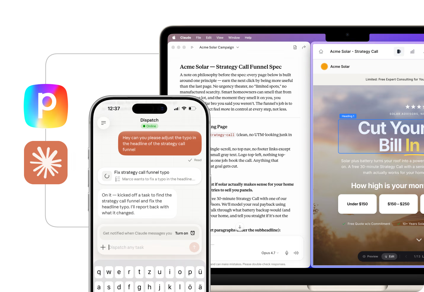
With Perspective, you describe the funnel you want and the AI builds it live, matched to your brand and offer.
How to build your own webinar landing page
Start with the headline, not the design. The 23 webinar landing page examples above show that the value proposition decides the conversion rate before any visual choice matters. Write the offer in one sentence that names the specific outcome and the audience, then test variations before committing to layout.
With Perspective, the AI builds each webinar funnel in your brand voice and edits on request. It even fixes the weak spots for you, the optimising most landing page builders leave to you. Start from one of the examples above.
FAQs: webinar landing pages
Quick answers to common questions about the webinar landing page examples above.
What is a webinar landing page?
A webinar landing page is a single-purpose page where visitors register for a live or pre-recorded webinar. The page exists to convert traffic into registrants, not to educate or entertain. Every element above the fold serves that one decision.
Most follow the same anatomy: a headline, a short form, social proof, and one date and time. Anything else competes with the registration action and usually costs conversion.
What should a webinar landing page include?
A webinar landing page should include a specific headline that names the outcome, a registration form with two or three fields, proof that the host can deliver, and the date, time, and time zone in a visible location. Most pages beyond that minimum start losing conversion rate.
Optional additions include an agenda, a host bio, and a video preview. These belong below the fold and only if the audience needs them. For warm traffic, removing all three usually lifts conversion.
What is a good conversion rate for a webinar landing page?
Good webinar landing page conversion rates sit at 15-30 percent for paid traffic, and 30-50 percent for warm traffic from email or an existing audience. The 23 pages here range from 11 to 53 percent.
Below 10 percent usually means the headline is generic or the form has too many fields. Above 50 percent typically requires both warm traffic and a highly aligned offer.
How do I create a high-converting webinar landing page?
To create a high-converting webinar landing page, start with the headline. Study the 23 webinar landing page examples above, then write the offer in one sentence that names the audience and the outcome. Perspective's AI Template Personalization rewrites template copy in your brand voice, which removes the slowest part of iteration.
Once the page is live, measure the registration rate weekly and rebuild the headline first if it underperforms.
👉 Ready to ship a higher-converting webinar page, start your 14-day free trial.
Should a webinar landing page be long-form or short-form?
Short-form pages win for warm traffic and known audiences. The visitor already trusts the host, so a one-screen webinar landing page with a headline, form, and proof is enough. The 23 pages above that hit 40 percent and beyond all use this structure.
Long-form pages perform better for cold traffic, complex offers, or higher-ticket events. Additional context helps a cold visitor decide, but every extra element should earn its place.
What is the best tool to build a webinar landing page?
Perspective is the strongest webinar landing page builder for teams that need to ship fast, and most webinar landing pages above were built on it. AI Brand Profiles and AI Funnel Duplication let you launch new pages in minutes, with mobile-first templates that match how teams now run paid traffic.
Other builders work for simple one-off events, but the iteration speed gap shows up immediately at scale.
👉 To try the approach on your own traffic, start your 14-day free trial.
Build your own webinar landing page examples in Perspective
Most webinar landing page examples that convert above 20 percent share one thing, a builder that lets the marketing team ship fast. Perspective makes that practical with AI-assisted setup, mobile-first templates, and the conversion architecture already baked in.
✔️ AI builds your funnel from a description in minutes
✔️ Mobile-first pages that convert
✔️ Hosting, lead capture, email, A/B testing, and CRM built in
✔️ Plan campaigns on real data, then spot leaks and ship fixes in chat
✔️ GA4 analytics and pixel integrations
✔️ Predictable pricing after the trial, starting at $47/month
Start your free trial of Perspective 👇

.png)